Type of applicant company
设计机构
Country
中国
Company Website
无
Images


Brand of the Product
QIAO LE ZI
Designer Name
Creative Director: Zhang Yanhui Designer: XuRuoLan Technical director: Zhou Xiaoli
Position of Designer
Creative Director: Zhang Yanhui Designer: XuRuoLan Technical director: Zhou Xiaoli
Target Consumer
Young women aged 16-28 (students, office workers), love life and enjoy food
Distribution Channels
电商 E-commerce; 大型商场 Shopping Mall; 小型商超和便利店 Supermarket & CVS; 杂货店 Grocery
Positioning
大货消费品 Mass Production
Design Story
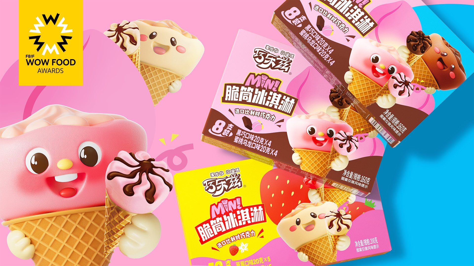
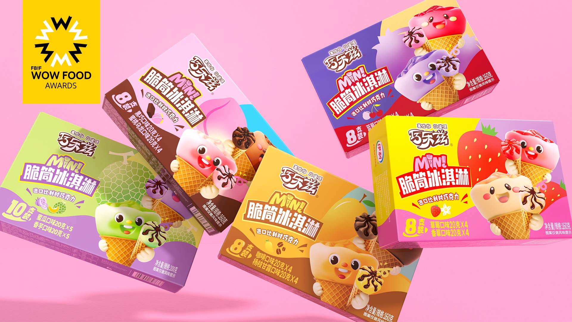
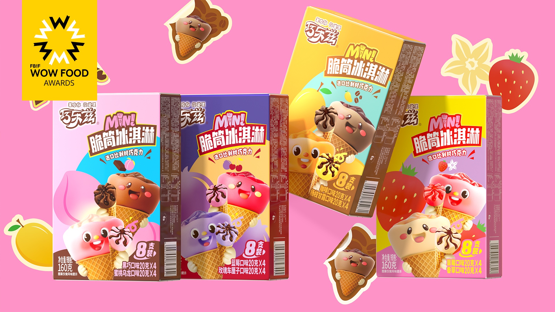
This series of products is a new revision and upgrade of the original "Small V Cone Ice Cream" series. It is hoped that while maintaining the sense of a product series, it will highlight the "small and cute" characteristics of this series of products with the core vision. Lively, interesting, and colorful, placed in series on the terminal, they stand out even more!The packaging design uses the soft and cute image of a human child combined with clouds to personify the crispy tube. Different flavor combinations shape the product series family, forming a significant difference from similar products.The IP shape uses conveying movements to highlight the interactive experience of happy sharing and shorten the distance with consumers.The outer packaging enlarges the combination of the two IPs. The colorful and bright dopamine colors are combined with different fruit illustrations. The front and back sides are presented in horizontal and vertical versions. No matter how it is displayed, it is very eye-catching.
Highlights
The crisp tube is personified with the soft and cute image of a human child combined with a cloud. The action of sharing and passing can quickly bring consumers closer and form a sense of series of product family;The outer packaging magnifies the combination of the two IPs, and the bright colors combined with different fruit illustrations are very eye-catching.
Market Performance
无
Material(For concept works, please choose the material you plan to use)
纸质 Paper
Craft
The outer box is made of food-grade white cardboard, four-color printing, integrally covered with light film, and glued into shape.
Does the design solve the problems that are common across the product category? If so, please explain.
Most of the product packaging in the ice cream category highlights the product's photos to reflect the sense of appetite. It is very homogeneous and has no interaction and communication with consumers.The design of this series of products directly combines the product with the IP image, and establishes a family series of products, forming a significant difference from competing products, and generating interactions and topics with consumers!
What functional designs of the work have enhanced the user experience?
无
Did the design help increase the sales performance of the product? If so, please give related evidence.
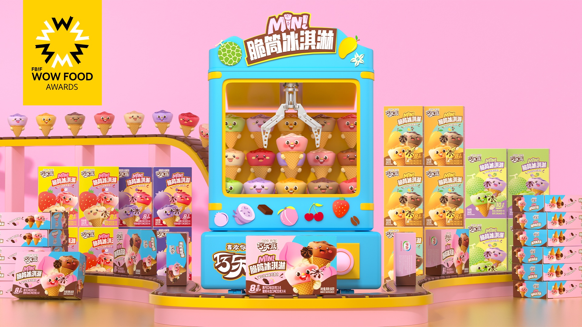
This series of works highlights the characteristics of the product, creates an interesting and cute IP family, can better interact with young consumer products, and can stand out in online and offline sales channels, and generate more topics and communication in commercial promotion. All can directly improve product sales performance.
Does the work consider sustainability (environmentally or commercially, or both)? If so, please explain.
The commercial core of this series of works is to create a product-specific IP family.Each family member will have a different role, personality, emotions, stories, preferences, etc.Therefore, the application of this family is not only in product packaging design or new product development, but also more widely used in different fields of communication, film and television, entertainment, cultural and creative, games, and motion marketing, continuously outputting sustainable products for brands and products. commercial value!