Country
中国(China)
Official website
https://www.zhongxuegao.com/
Company Introduction
Our company name, Chicecream, is pronounced in Chinese from three ancient family names: "zhong xue gao” and is pronounced similarly to the Chinese word for ice cream. The design of the ice cream is inspired by the unique Chinese tile shape. The top of the ice-cream has a rectangular pattern, similar to the shape of a Chinese character "Hui". We designed this pattern with the idea of returning the food to its original taste. It also means "whole food" and "organic". We collect good ingredients and do our best to recreate the original flavor of the ingredients. From 2019 to 2021, Chicecream has won 27 consecutive ITQI Taste Awards, known as the "Oscars of the Tongue". A flavorful Chicecream, a slice of ice cream to savor!
Images


Brand Name
Chicecream desserted product line
Designer Name
Wang shuai
Position of Designer
Industrial Designer
Target Group
Our customer group is the highly educated group, who value a lot on food quality. High level of education, high income, high requirements for food quality, pleasure in shopping, those above are clear tags of our customers. They have a well-defined demand for a more comprehensive consumer experience, more in-depth consumer education and richer consumer values. And they join us in advancing the aesthetics of the new Chinese art. In addition, they recognize our new Chinese aesthetic art that we have been working on.
Major sales
电商 E-commerce
Positioning
限量款/联名款 Limited Edition/IP Collaboration
Design Story
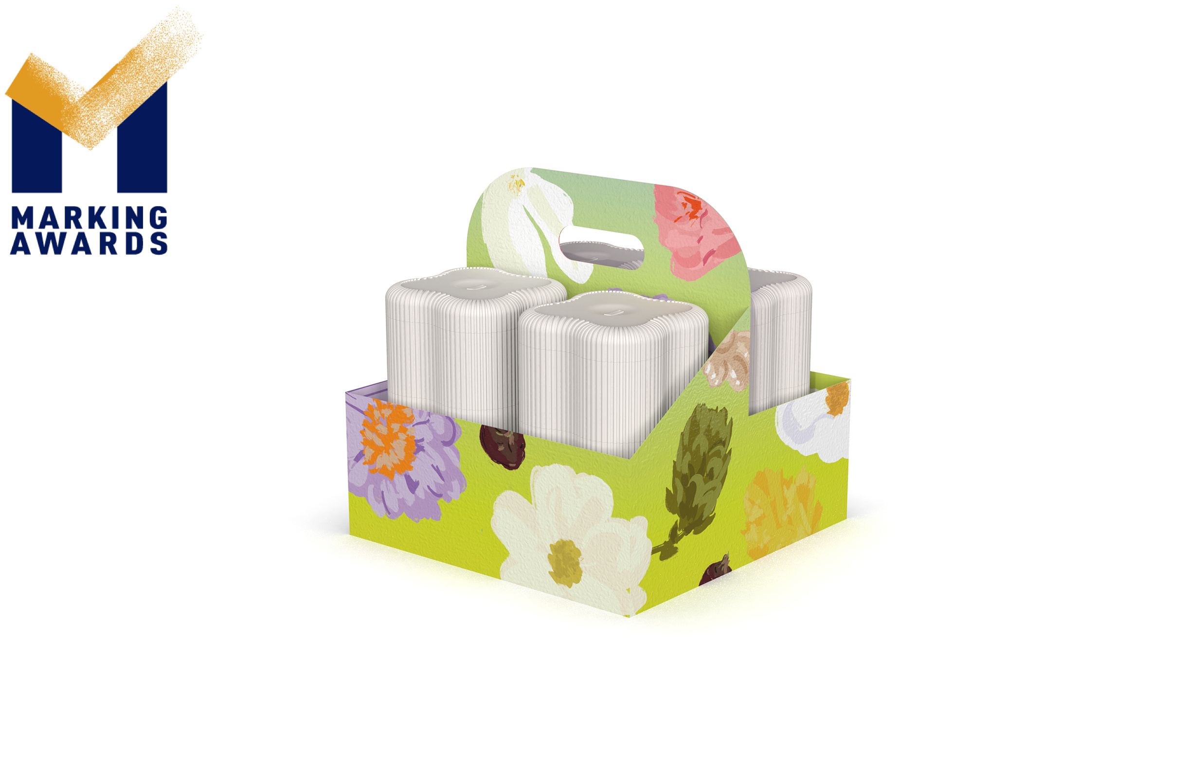
Chicecream desserted product line, is a new sub product line under Chicecream brand. We aim to explore new combinations of ingredients, flavors and concepts of ice cream to fulfill our product portfolio. The new product, to be launched in spring 2022, have been inspired by "flower & plants" as their main source of inspiration and raw material. We want to express the message: our brand's ongoing commitment to a neo-Chinese aesthetic, while clearly reflecting the content keywords "flower & plant", "spring" and "appreciation". The design of the product packaging structure is inspired by the traditional Chinese food box. The structure, layered up to accommodate six different flavors ice creams, inspired by Chinese traditional container from Song Dynasty. The four-petal flower shape expresses the theme of the product and is easy to assemble and transport. The box's thin 'ribs' design is visually and tactilely memorable, while not freezing the consumer's hands and being easy to release from mold during production. And the overall visual presentation combines Chinese aesthetic. Consumers will feel a sense of high ceremony and value while using it. The hand-painted flower and plant motifs used in the outer box design expose consumers to a sense of nature and freshness. The portable handheld design is suitable for various typical outdoor activities during spring such as camping, picnics and gift-giving.
Highlights
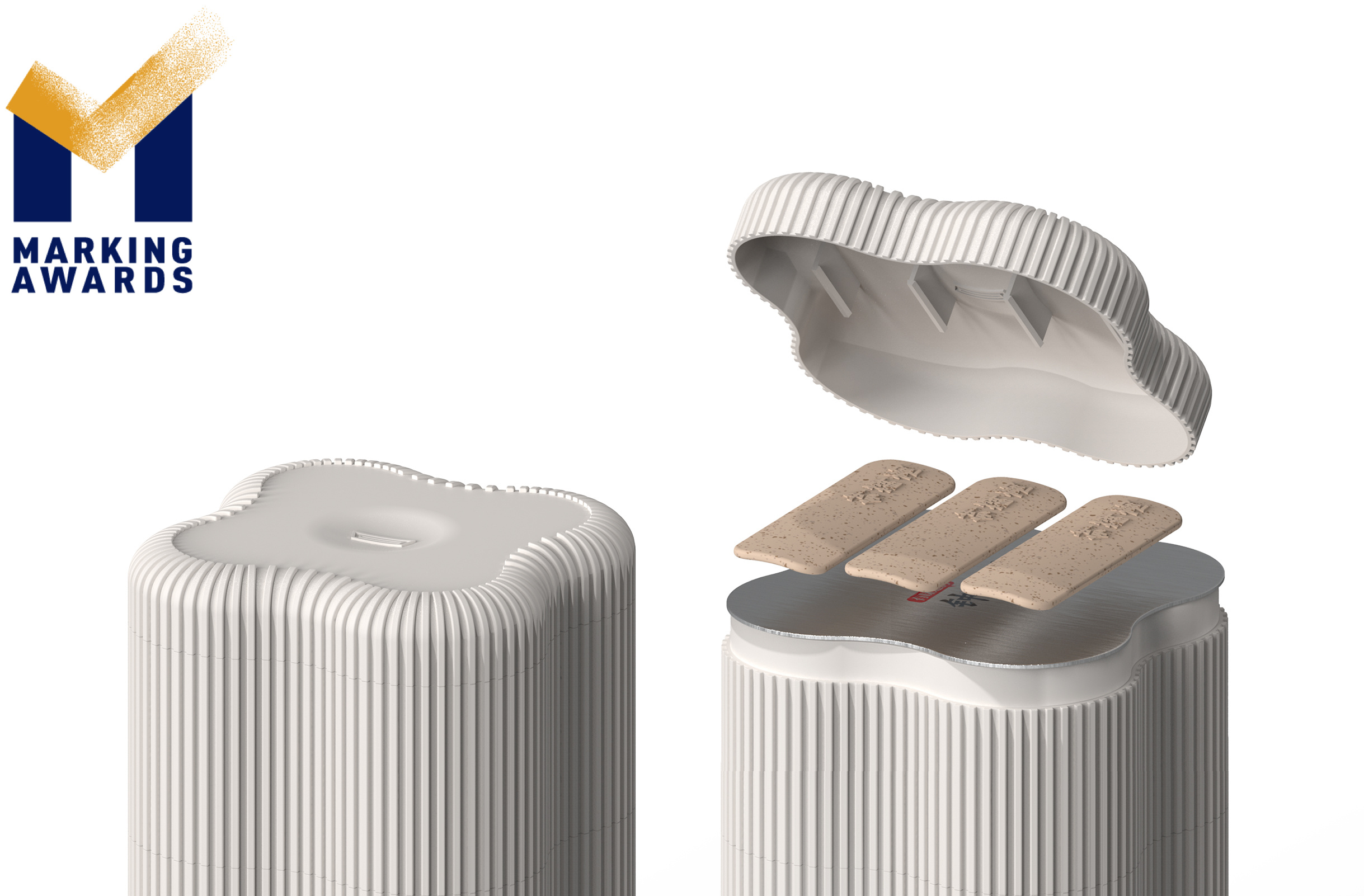
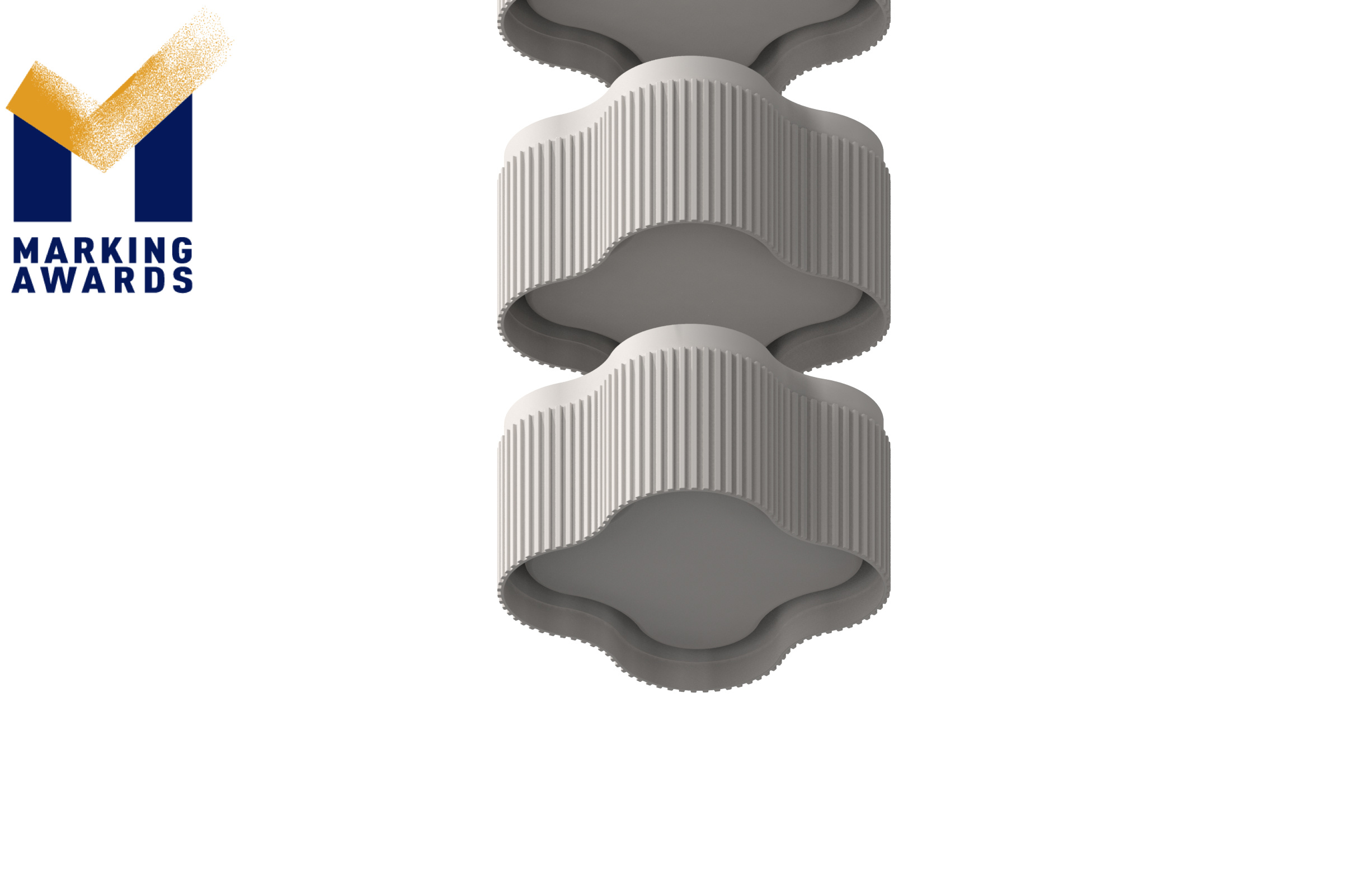
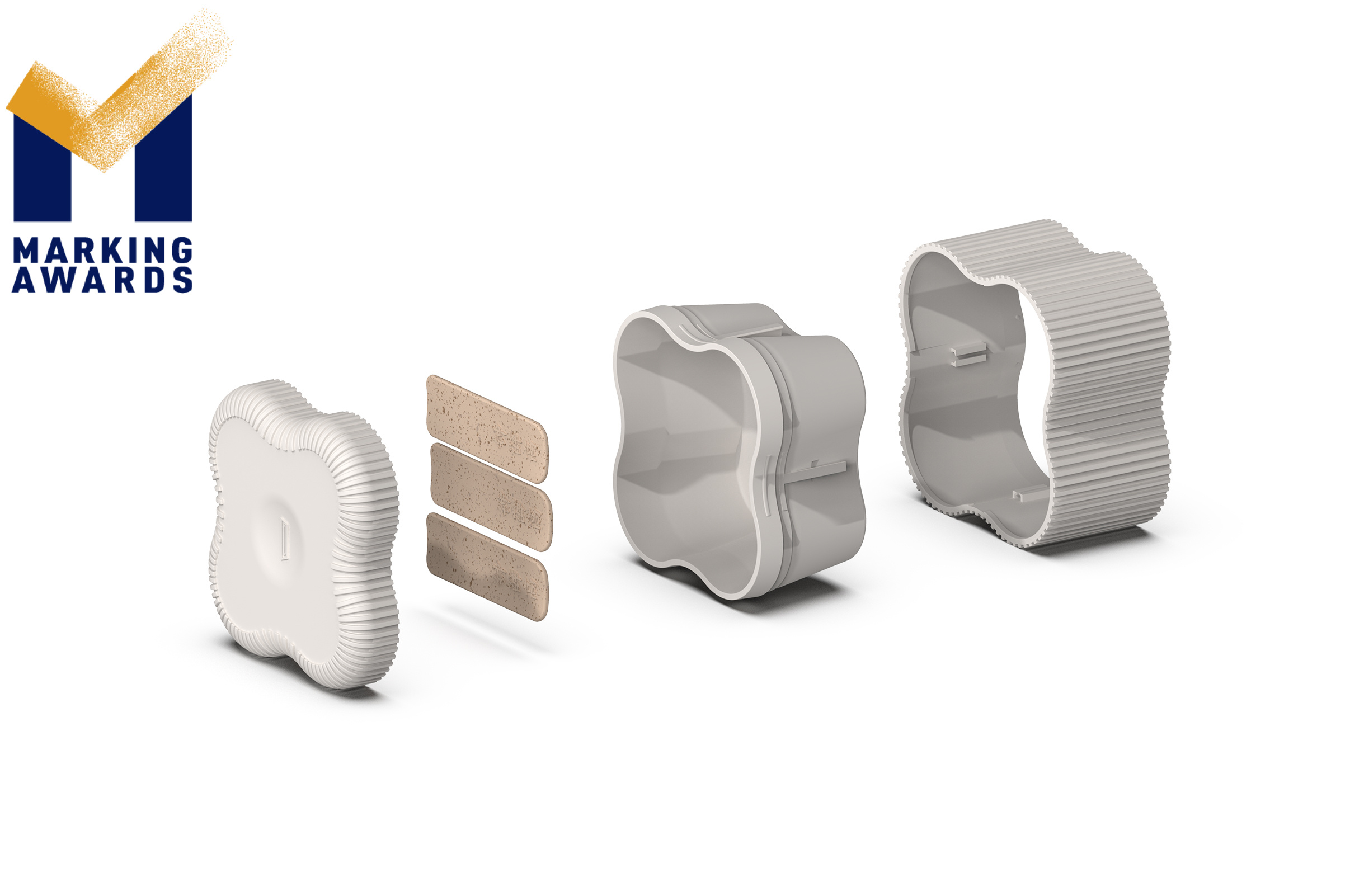
1. The two-layer structure of the ice cream bento: it has an insulation function, the ice cream does not melt easily and does not freeze in hands, these properties can offer consumers a good consumption experience; it is easier to clean on the production line, reducing the risk of microorganisms; it effectively dampens the shock and prevents the box from breaking in a -78°C dry ice transport environment. 2. The thin outer “Ribs” minimize the impact of the mold angle on the appearance of the box (straight wall) when the mold is pulled out; Meanwhile, it increases friction and makes it easier for consumers to open and upgrade their experience.
Market Performance
无
Material
其他
Craft
作品工艺描述(英文):The ice cream bento is made of polypropylene and injection molding process; The boxes are laminated with a tear-off film and then sealed by heat pressing. This is a packaging method rarely found on the market for ice cream. The injection molded box is a double-layered snap structure, which makes it easier to clean on the production line and reduces the risk of micro-organisms, while having an insulating effect so that the ice cream does not melt easily and does not freeze in the hands. The " Ribs " of the box facilitate the release of the box from the mold during industrial production and minimize the impact of the extraction angle on the appearance of the box (straight wall).
Does the design solve the problems that are common across the product category?
Most of the ice cream bowls on the market today are made of blister technology, which is light and thin, but makes consumers' hands feel freezing and makes the ice cream melt easily. However, the ice cream bento has a double-layered bayonet construction, meaning that the thickness of the shell is not increased excessively, while solving the problem of consumers' hands feel freezing and easily melt. The vertical outer shell has always been a challenge for industrial design and manufacture. The 'Ribs' design reduces the extraction angle significantly, making it easier to release the shell without creating pull marks. The "Ribs" also increase the friction and facilitate the opening of tightly sealed lids.
What functional designs of the work have enhanced the user experience?
The ice cream bento is double layered with a snap closure, which provides a temperature barrier and keeps the ice cream from melting and freezing. The "Ribs" are designed to increase the friction and make it easier for the consumer to open the tightly sealed lid. Meanwhile, the thin outer 'Ribs' act as a strong visual and tactile symbol, guiding the consumer to view and repeatedly touch them. Under a good sense of touch will lead to positive emotional feedbacks and consumer experiences.
Does the work consider sustainability (environmentally or commercially, or both)?
The ice cream bento is designed based on a sustainable concept, it is sustainable in terms of business logic and materials. The box has a high secondary use value for consumers. In terms of business logic, the 'Ribs' as its visual symbol will be seen repeatedly by consumers when they reuse it. Ultimately, the visual symbol of the 'Ribs' will be recognized, and the product will be business logically sustainable. We use polypropylene (PP) as a packaging material which is extremely ductile difficult to break or crack on impact. This property extends the life cycle of the product. After the end of its product life, it can also enter the recycling system for secondary use of plastics.