Type of applicant company
品牌方
Country
中国
Company Website
https://www.snowbeer.com.cn/
Images


Brand of the Product
CHINA RESOURCES SNOW BREWERIES
Designer Name
Dong Yan, Weixi Zhou, Yan Yang, Jialiang Mao
Position of Designer
None
Target Consumer
young consumers aged 18-35 who love travel and have an appreciation for Hainan culture
Distribution Channels
电商 E-commerce; 大型商场 Shopping Mall; 小型商超和便利店 Supermarket & CVS; 杂货店 Grocery; 餐饮&酒店 Restaurants & Hotel
Positioning
大货消费品 Mass Production
Design Story
Drawing inspiration from natural scenery and local culture in Hainan, the packaging for Hainan Beer aims to embody the charm of Hainan when catering to modern aesthetic taste. The design team has traveled to Hainan for an on-site investigation, and delved deeply into the local environmental and cultural characteristics. Based on that, the packaging features localization of design and adopts refreshing colors along with lively patterns, making customers feel as if they were on the beaches of Hainan.
Highlights
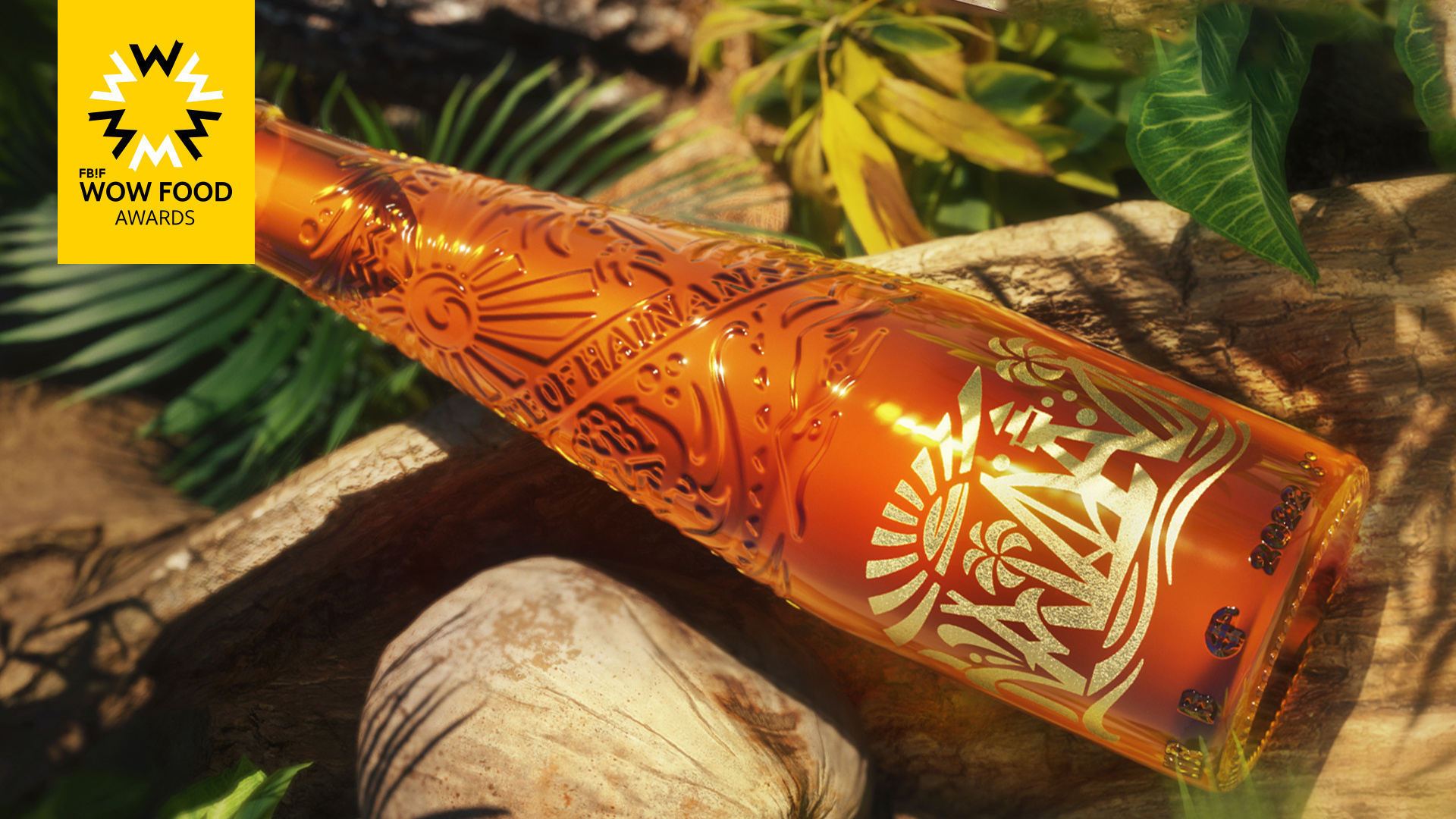
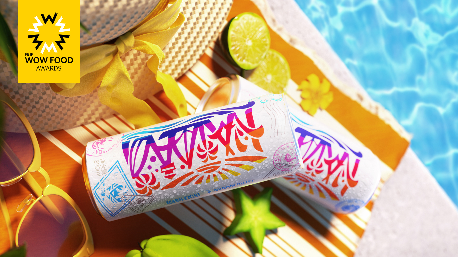
The highly recognizable logo ensures that bottle packaging and can packaging have the consistent style. The word “HAINAN” as the main body of the logo is subtly integrated with local typical elements including sea waves, sailing boasts, the sun, etc., bringing to mind the natural scenery in Hainan.
For bottle packaging, the relief on the highly transparent glass body is a synthesis of the local landmark landscape and a typical ribbon of native Li nation with characteristic patterns, which suggests the harmonious symbiosis between traditional national culture and natural ecology in Hainan. The can packaging takes white color as the background to highlight the core visual symbol in gorgeous colors, so as to vividly show the unique charm of Hainan and leave a lasting impression on consumers.
Market Performance
None
Material(For concept works, please choose the material you plan to use)
其他 玻璃
Craft
glass bottle; aluminium can; relief sculpture; thermochromic ink, outer paper box made of kraft paper; coconut scented label
Does the design solve the problems that are common across the product category? If so, please explain.
To stand out from the largely homogeneous market and achieve an eye-catching effect, the packaging sheds conventional design ideas, and integrates the abstract patterns of local typical elements like beaches into the word “HAINAN”, which leads to strong visual impact and creates an atmosphere full of vigor.
What functional designs of the work have enhanced the user experience?
The glass body is designed to be slim and thus easy to grip; every flavour is clearly stated through the corresponding color, whereby to provide visual facilitation for shoppers to distinguish among various flavours and choose the favourite quickly. Thanks to the special thermochromic ink, the postmark patterns on the can under refrigeration will appear, contributing to a more interesting interaction experience.
Did the design help increase the sales performance of the product? If so, please give related evidence.
None
Does the work consider sustainability (environmentally or commercially, or both)? If so, please explain.
The outer packaging for the product is made of kraft paper to effectively reduce the use of printing ink. Such a design also conveys a consumption concept of “environmental protection and harmonious coexistence”, and encourages consumers to actively practise sustainable development.