Type of applicant company
供应商
Country
中国
Company Website
WWW.YSPRINT.COM
Images


Brand of the Product
YOUNGSUN MEMO
Designer Name
YE LIAO
Position of Designer
Desinger Director
Target Consumer
Manufacturer and brand owner of chocolate or candies, and other similar food or snacks; start-up company for chocolate or candy; Influencer’s brand or other company looking forward to new, original and fashion; Company gifts searcher;
Distribution Channels
电商 E-commerce; 大型商场 Shopping Mall; 小型商超和便利店 Supermarket & CVS; 其他销售渠道 公司的礼品
Positioning
大货消费品 Mass Production
Design Story
In recent years, many new brands in FMCG are developing and coming into prominence. Their requests for packaging is constantly more. As the first media for communicating with consumers, packaging box needs to convey brand message and product attributes quickly and directly to users. Also, the box has to be standing out of its peers, to help to earn consumers’ fondness. As a result, we plan to design a paper packaging box with creativity both in graphic and structure. Also, we noticed that consumers’ emotions are key promotion part for many brands. So we also highlight emotion care.
Highlights
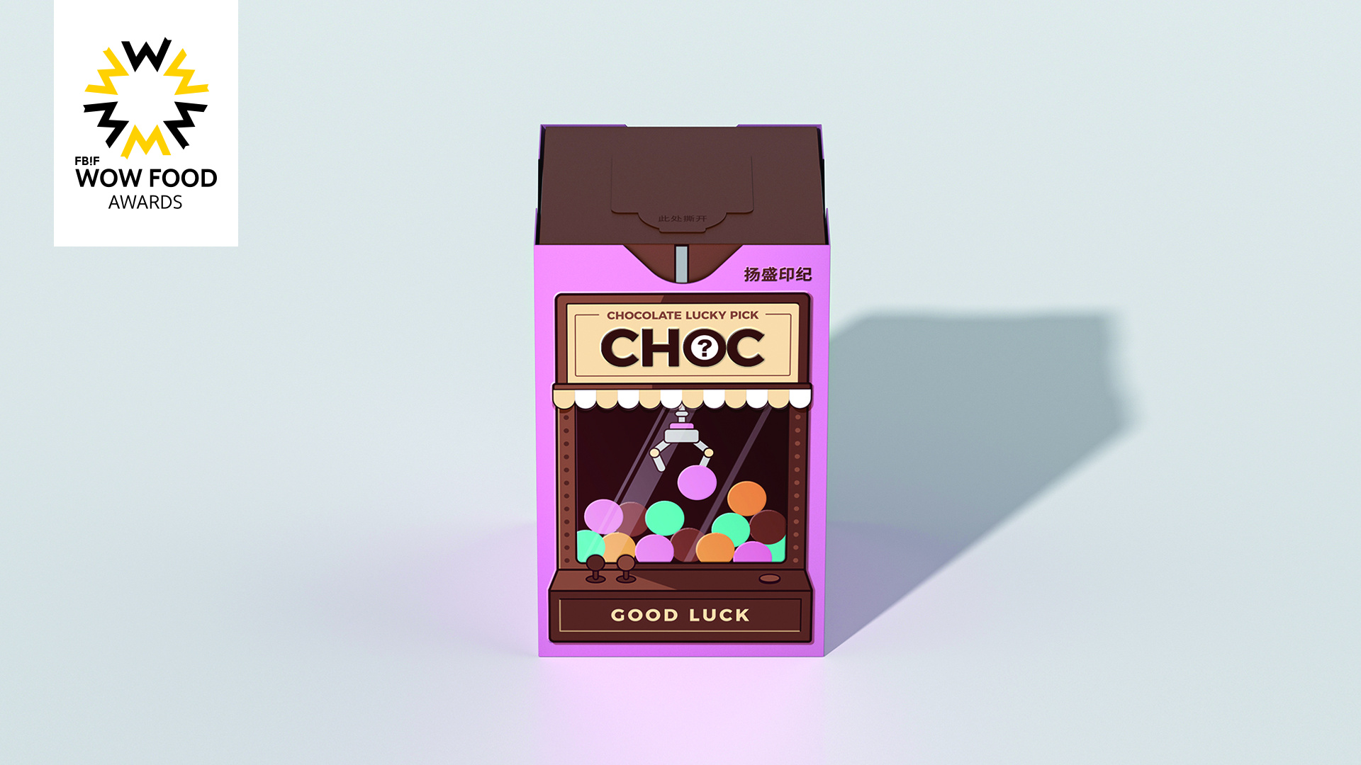
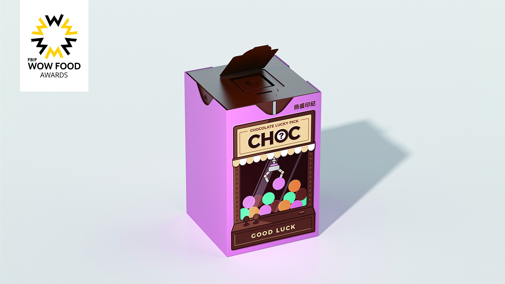
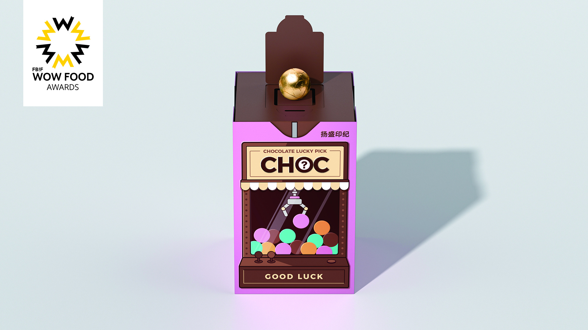
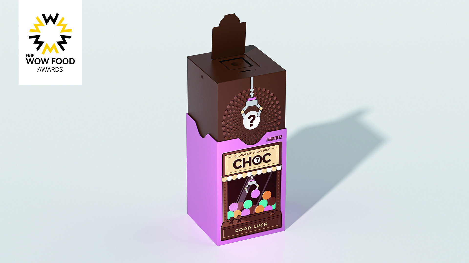
For this box, the structure is the most particular part. Basically it is a drawer box but with a special gimmick. Due to it, the inside chocolate can be gripped and put on the top of the opening platform of the box. The process of getting chocolate is an imitation of Claw Catch Machine. Graphic design focus on Claw Catch Machine and chocolate. It looks like the machines’ appearance (glass cove and mechanical turnover), recalling consumers’ memory of dolls catcher. In this creativity packaging, the graphic design is working in concert with the structure. Inside each chocolate packaging, there is a piece of paper, on which there are funny, smart, wishes or warm sentence to comfort, to encourage, to bring a kind of close friend feeling between consumers and brand.
Market Performance
NA
Material(For concept works, please choose the material you plan to use)
纸质 Paper
Craft
The box uses carbon-free FSC certified Lightweight Paper Boards as raw material, which means that during the paper manufacturing process, there is 0 CO2 released to the air. On the surface of the box, for chocolate part we use embossing to highlight the product; we use hot stamping with transparent foil to stand out the brand name. While opening the box, we use silk-printing with glossy vanishing to emphasize the opening distinctiveness of the box.
Does the design solve the problems that are common across the product category? If so, please explain.
Most Chocolate paper packaging boxes are normal structure. Ours highlights on opening interaction with consumers.
What functional designs of the work have enhanced the user experience?
There is a gimmick inside the paper box. Every time when consumer pulling upside the inside drawer box, there only one chocolate can be catch. Each chocolate has wrapping paper with different colors and different paper strips with different fortune words. It brings consumers an emotional impulsion to pursue for different fortune.
Did the design help increase the sales performance of the product? If so, please give related evidence.
NA
Does the work consider sustainability (environmentally or commercially, or both)? If so, please explain.
The box uses carbon-free FSC certified Lightweight Paper Boards as raw material, which means that during the paper manufacturing process, there is 0 CO2 released to the air.