Type of applicant company
品牌方
Country
中国
Company Website
无
Images


Brand of the Product
KaKaFan
Designer Name
ACGBOX Design Studio
Position of Designer
/
Target Consumer
Teenagers aged 13 to 18 who love Pokémon characters, and often engaging in impulsive spending for their interests.
Distribution Channels
电商 E-commerce; 大型商场 Shopping Mall; 小型商超和便利店 Supermarket & CVS; 杂货店 Grocery; 其他销售渠道 潮玩店
Positioning
限量款/联名款/区域限定 Limited Edition/IP Collaboration/Located Edition
Design Story
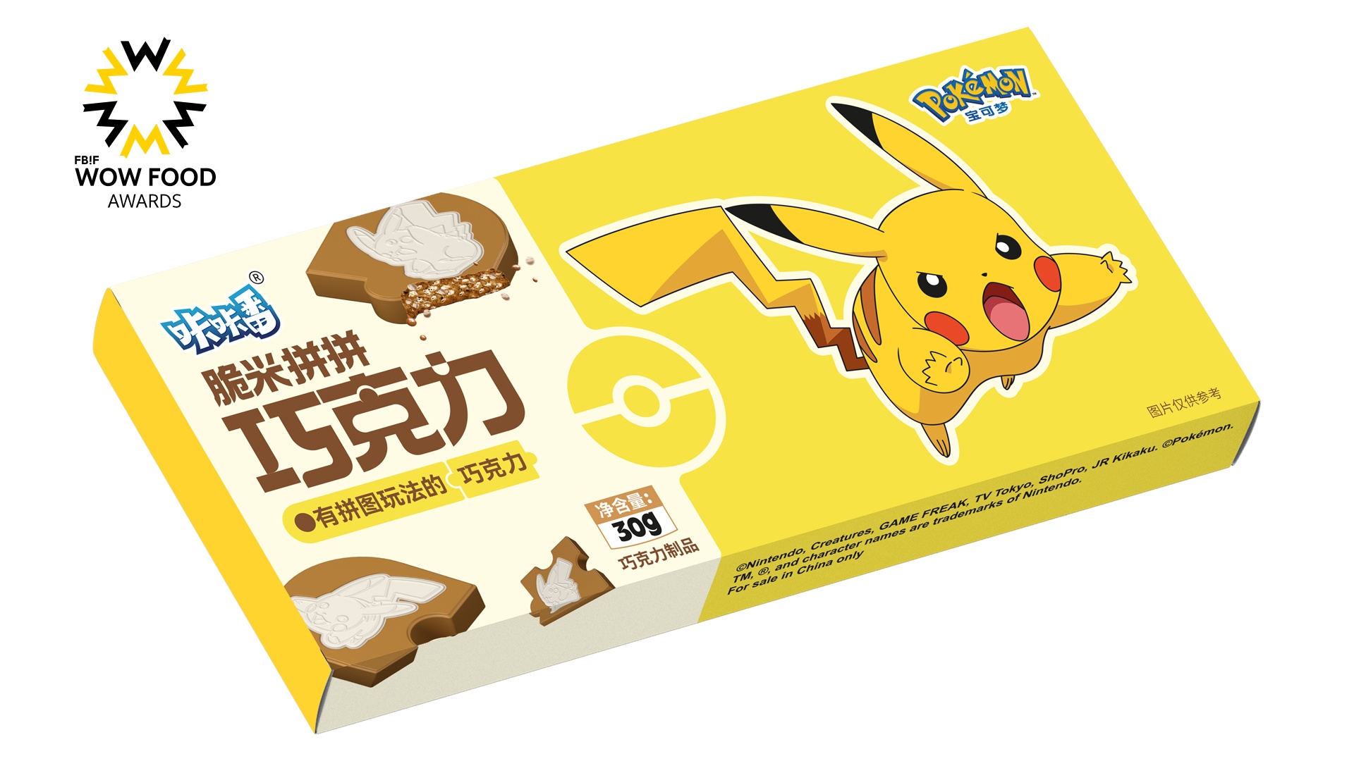
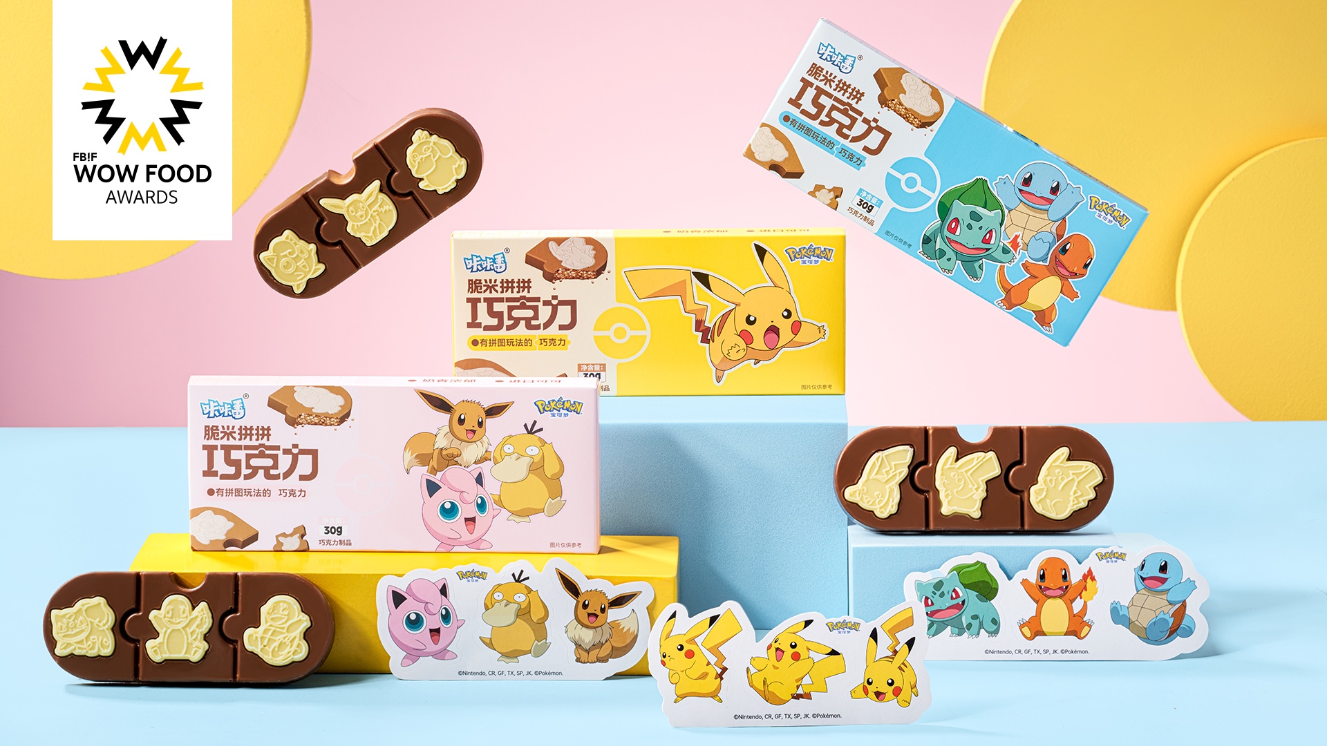
The packaging boxes of the product not only feature bright colors such as blue, yellow, and pink as the main tones but also meticulously imprint Pokémon patterns corresponding to the chocolate designs on each box. This distinctive and personalized packaging design strikes a delicate balance between art and commerce, providing consumers with a visual feast.
Highlights
The Pokémon patterns on the packaging box creatively combine with the chocolates inside, elevating the packaging itself into a unique piece of art. This design not only captures the interest of customers but also turns the packaging into a cultural symbol that goes beyond practicality, making consumers buy not only for the product itself but also for the creative and narrative packaging.
The product is individually wrapped in exquisite packaging, enhancing its portability and expanding its range of usage scenarios. This allows consumers to easily integrate the product into various aspects of their lives, savoring its deliciousness anytime, anywhere.
Market Performance
/
Material(For concept works, please choose the material you plan to use)
PET塑料 PET material; 纸质 Paper
Craft
The packaging box of the product not only features bright colors such as blue, yellow, and pink as the main tones but also meticulously imprints Pokémon patterns corresponding to the chocolate designs on each box. This distinctive and personalized packaging design strikes a delicate balance between art and commerce, providing consumers with a visual feast. The Pokémon patterns on the packaging box creatively combine with the chocolates inside, elevating the packaging itself into a unique piece of art. The outer box craftsmanship employs reverse UV, combining matte and glossy finishes to create a stronger contrast in brightness, highlighting the Pokémon images on the packaging even more.
Does the design solve the problems that are common across the product category? If so, please explain.
/
What functional designs of the work have enhanced the user experience?
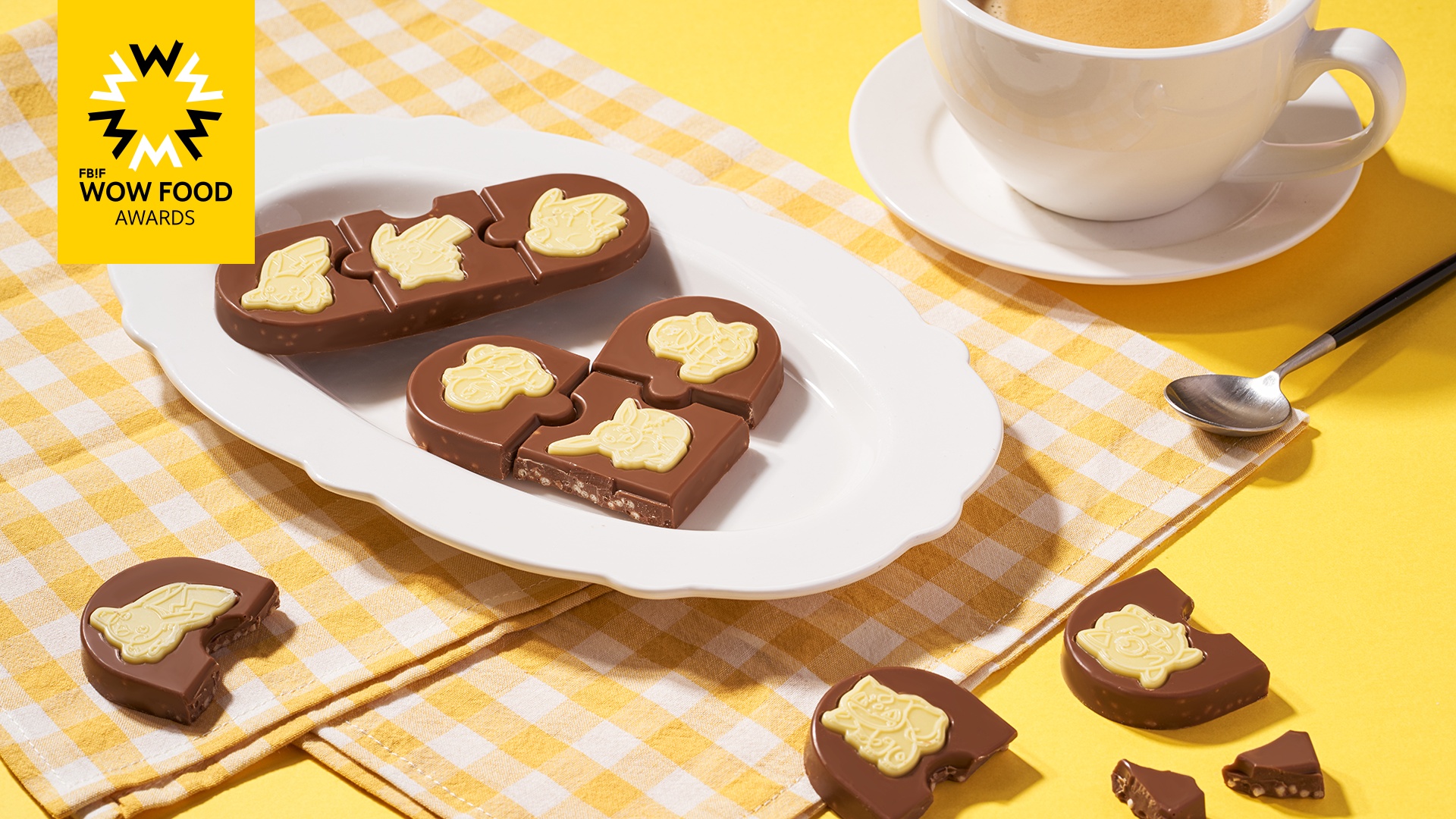
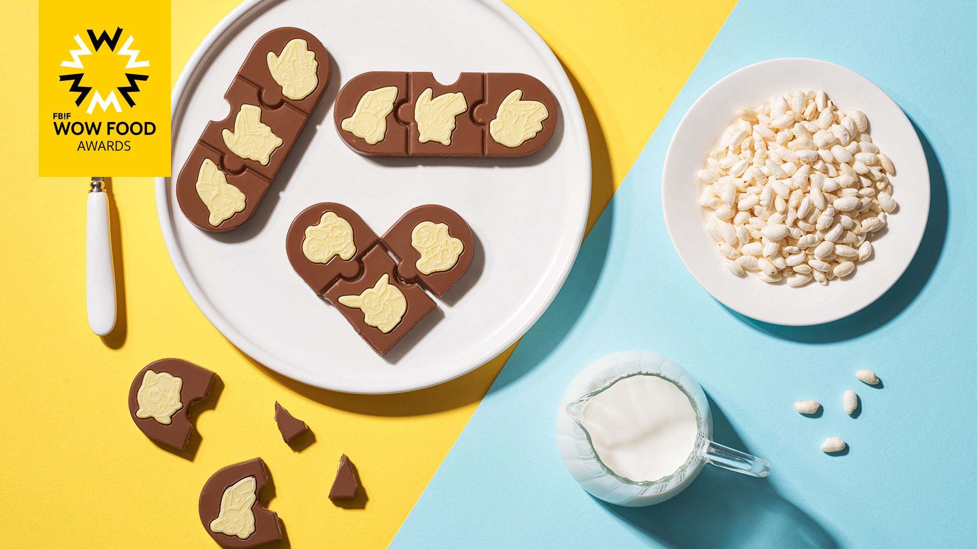
The product, from the overall packaging to the shape of the food, emphasizes the combination of food and play, allowing consumers to derive enjoyment while indulging in the delicious experience. Consumers can personally transform the packaging boxes, using them for collecting, creating journals, and embellishing their lives, imparting a completely new attribute to the packaging.
Did the design help increase the sales performance of the product? If so, please give related evidence.
This product is highly popular in the market and has garnered widespread attention from both children and parents during Pokémon-related offline events.
Does the work consider sustainability (environmentally or commercially, or both)? If so, please explain.
1. The internal food items are individually packaged, and the outer packaging box is made from food-grade, recyclable, and environmentally friendly materials, facilitating easy degradation and secondary use.
2. It is an IP collaborative product with a strong sense of series, making it convenient for subsequent product development.