Type of applicant company
设计机构
Country
中国
Company Website
无
Images


Brand of the Product
SHIKUMEN
Designer Name
KEY BRAND DESIGN
Position of Designer
GCD- Aiya Hou、CD-Zhihao Zhang
Target Consumer
Focus on 30-45 years old new business, new middle class and other elite groups in Jiangsu, Zhejiang and Shanghai.
Distribution Channels
电商 E-commerce; 大型商场 Shopping Mall; 小型商超和便利店 Supermarket & CVS; 餐饮&酒店 Restaurants & Hotel
Positioning
大货消费品 Mass Production
Design Story
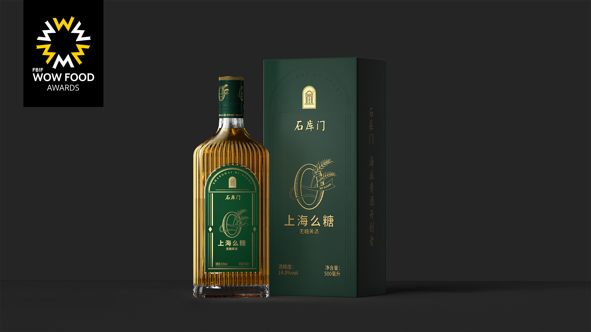
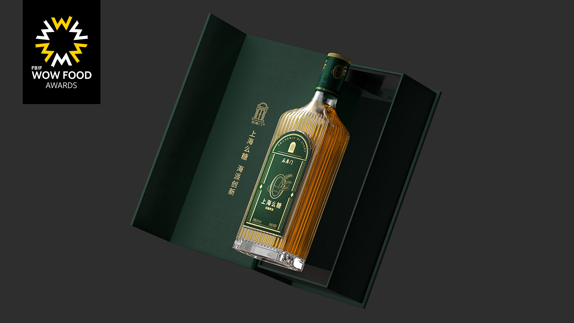
Visually, the bottle sticker features a flattened stone door as its exterior design, conveying a healthy lifestyle philosophy through "future green", complemented by gold to enhance quality. At the same time, the green label and the red label and black label in Shikumen form a system. The "0" visual hammer highlights the health attributes of Shanghai Mo Tang as a sugar free yellow wine. The bottle body adopts the sharp lines derived from the architecture of the Shanghai Bund as the bottle body, interpreting the Shanghai style aesthetics with the crystal clear texture of the light bottle, and strengthening the brand attributes of Shikumen Shanghai style yellow wine.
Highlights
The name of the product is Shanghai dialect, meaning "no sugar". Combined with Shanghai dialect, it has a local flavor of Shanghai.
Market Performance
none
Material(For concept works, please choose the material you plan to use)
其他 玻璃
Craft
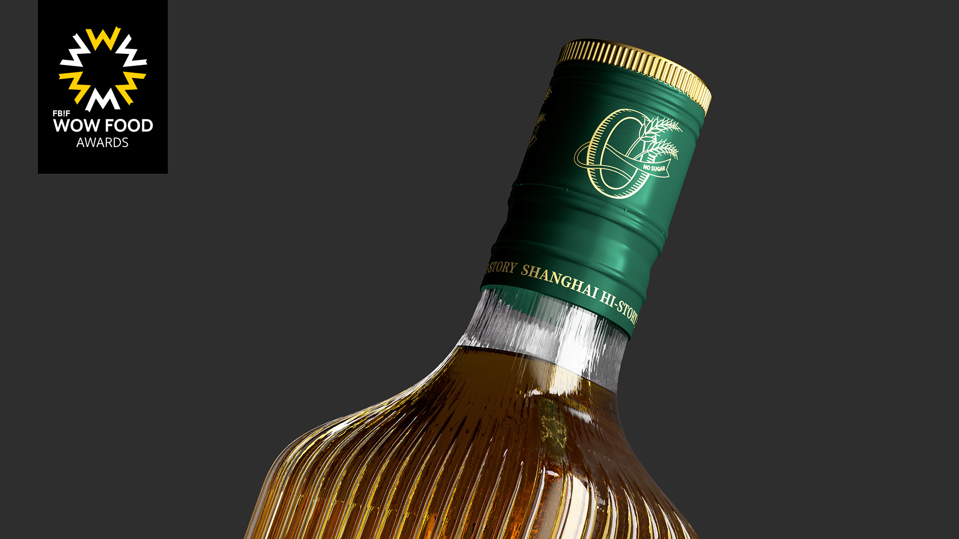
The bottle adopts the edges of Wanguo architecture from the Bund in Shanghai as the bottle body, interprets the Shanghai style aesthetics with the crystal clear texture of the light bottle, and strengthens the brand attributes of Shikumen Shanghai rice wine.