
Country
中国(China)
Official website
yuanqisenlin.com
Images
Brand Name
ALIENERGY
Designer Name
Uki Zhang;Shuo Qu;Kevin Zheng;Zonglin Li;Xiaolan Xiao;Yosan Jia;Rui Yang;Jiaqi Liu
Position of Designer
Packaging designer
Target Group
Students and white-collar workers aged 15-35 in first-tier cities
Major sales
电商 E-commerce; 大型商场 Shopping Mall; 小型商超和便利店 Supermarket & CVS; 杂货店 Grocery; 餐饮&酒店 Restaurants & Hotel
Positioning
大货 Mass Production
Design Story
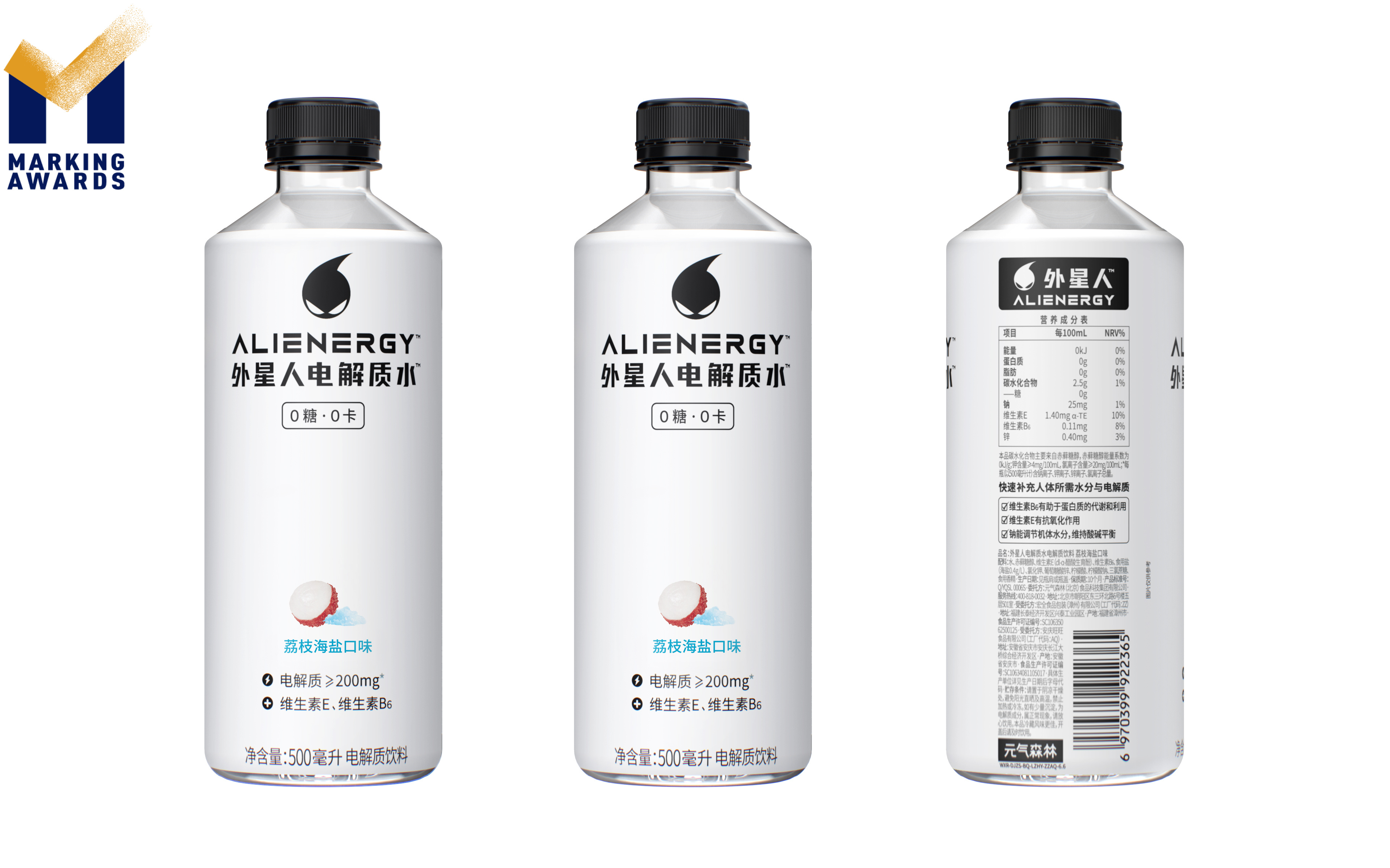
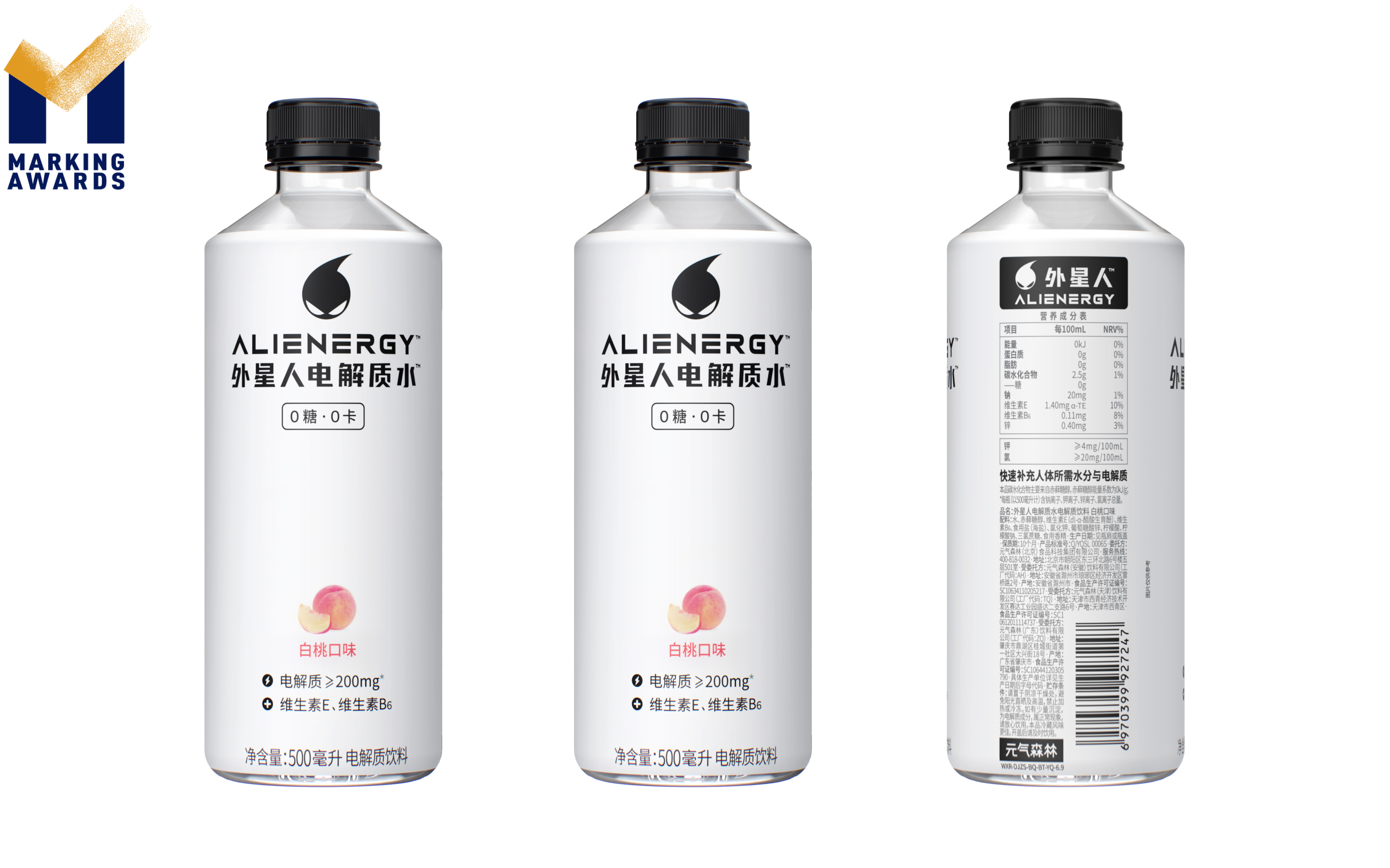
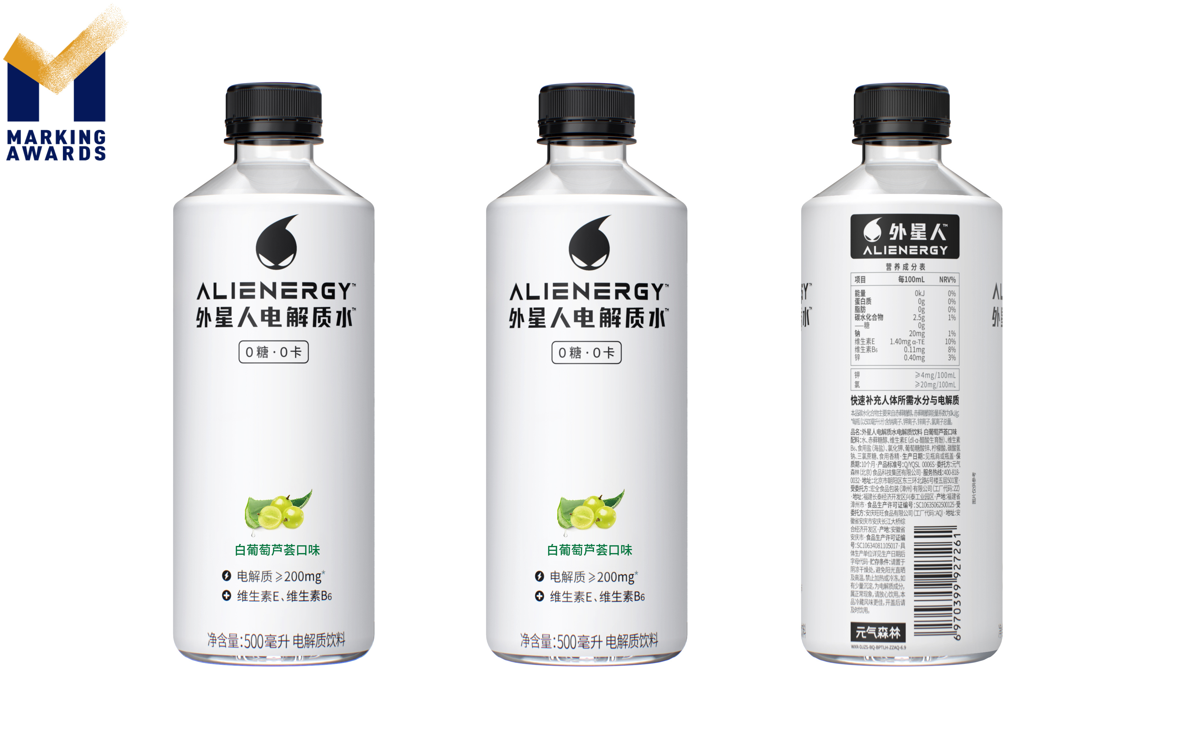
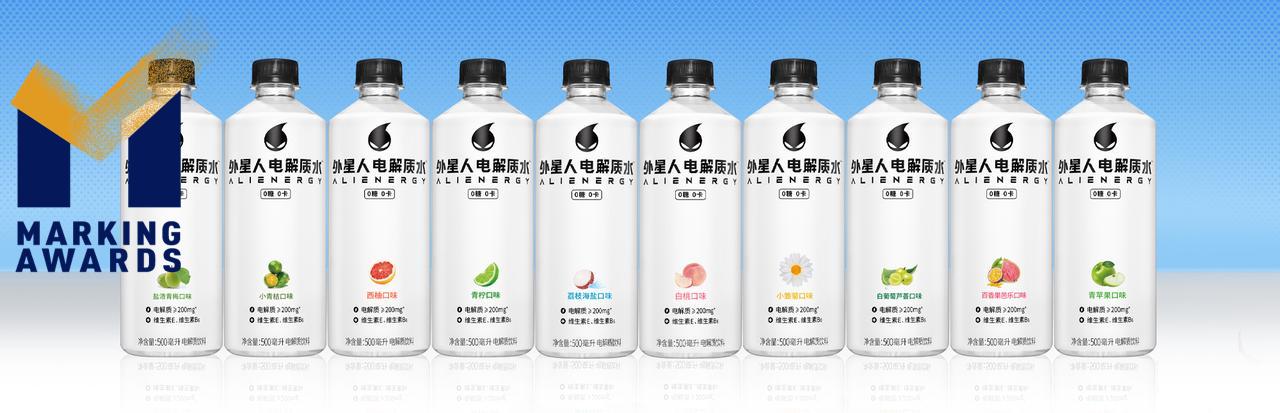
Alienergy Electrolyte Water is designed upon the minimalist philosophy to demonstrate its product concepts of clean, pure, and reviving. The bottle is shaped to be straight with clean-cut edges to indicate its simple and sproty characteristics; the composition of colors and elements also remains the simplest to illustrate its simple but effective formulation; and the semi-transparent bottle print showcases the ultra-hydrating and near-water features of the electrolyte water.
Highlights
Alienergy Electrolyte Water has 0 sugar and 0 calorie properties while overweight and diabetes are becoming harsh society concerns. However, hydration is nearly a rigid demand for most people in all seasons. Alienergy Electrolyte water aims to give all consumers refreshing and fruitful hydration experience with no sugar or calorie pressure.
Market Performance
无
Material
PET塑料 PET material
Craft
The label is designed with semi transparent material showcasing the ultra hydrating and near water features of the electrolyte water. And the material we chose is OPS, a sustainable substitute for PVC.
Does the design solve the problems that are common across the product category?
Alienergy is a brand that focuses on functional beverages, aiming to serve the need of the ever growing health-conscious population. Unlike the current designs on the market, the Electrolyte Water is designed upon the minimalist philosophy to demonstrate its product concept of healthy, pure, and reviving. Combined with the sugar free, calorie free formula, and clear water body, the customers can be hydrated and refreshed with zero pressure or health concerns.Most functional beverages on shelves today are colorful because they use food colorings for eye catching effects. Our product however, is proudly clear in color with zero food coloring, building more trust in the health conscious customers.
What functional designs of the work have enhanced the user experience?
Since the primary function of the Alienergy Electrolyte Water is to refresh and hydrate, the inspiration of the visual design is water. The straight clean-cut bottle shape, the semi-transparent body print material, and the negative space proportion all serve to compose a modern, sporty, and fresh design.Our product is packed in plastic bottles because they can be opened and closed freely with consumers' needs. This feature is important for hydration beverages as consumers usually drink them on-the-go and during sports. The straight bottle shape is also space-efficient; it save spaces for logistics and also for consumers' fridges.
Did the design help increase the sales performance of the product?
无
Does the work consider sustainability (environmentally or commercially, or both)?
The label is designed with semi transparent material showcasing the ultra hydrating and near water features of the electrolyte water. And the material we chose is OPS, a sustainable substitute for PVC. It can not only be recycled for further use, but can also be burned for fuel even after printing. The burning process won't emit any toxic gas, therefore no pollution created.