Country
中国(China)
Official website
无【Not】
Company Introduction
Ever since our company’s inception in 2007, our service has covered FMCG, infant, real estate, chain store, electronic products, tourism, clothes, IT and other industries. Boasting refined framework and process management system to serve clients, we continue to challenge ourselves and optimize the process to meet their increasing quality standards. By virtue of our prompt innovation response and the ability to implement the terminal design, we have consecutively served China Southern Power Grid for ten years, McDonald's for eight years, ABC for six years and Eastroc Super Drink for four years. At the same time, we also work to provide continuous and stable services of visual brands and the whole set of communication for various well-known brands like Mengniu, Midea, Infinitus, Starbucks, Yashili.
Images
Brand Name
Mengniu
Designer Name
Chen Jianchao、Liu Zijun、Liu Yuhao
Position of Designer
DD、Designer、Designer
Client
Inner Mongonia Mengniu Dairy (group) Co., Ltd.
Target Group
Lactose intolerant consumer groups
Major sales
电商 E-commerce; 大型商场 Shopping Mall; 小型商超和便利店 Supermarket & CVS; 杂货店 Grocery; 餐饮&酒店 Restaurants & Hotel
Positioning
大货 Mass Production
Design Story
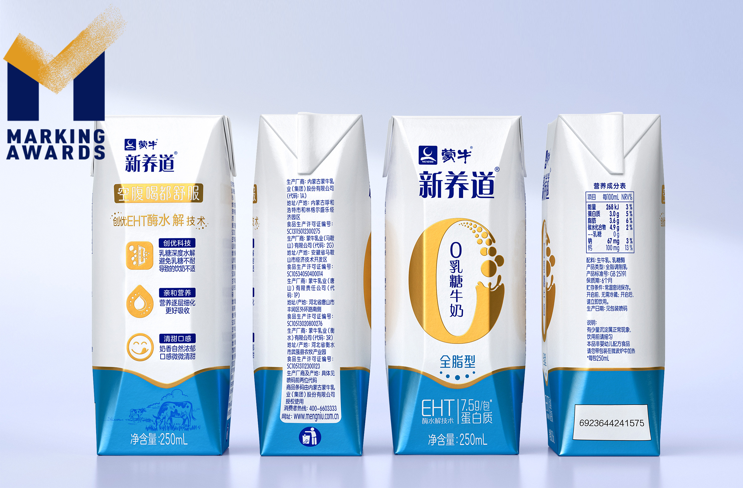
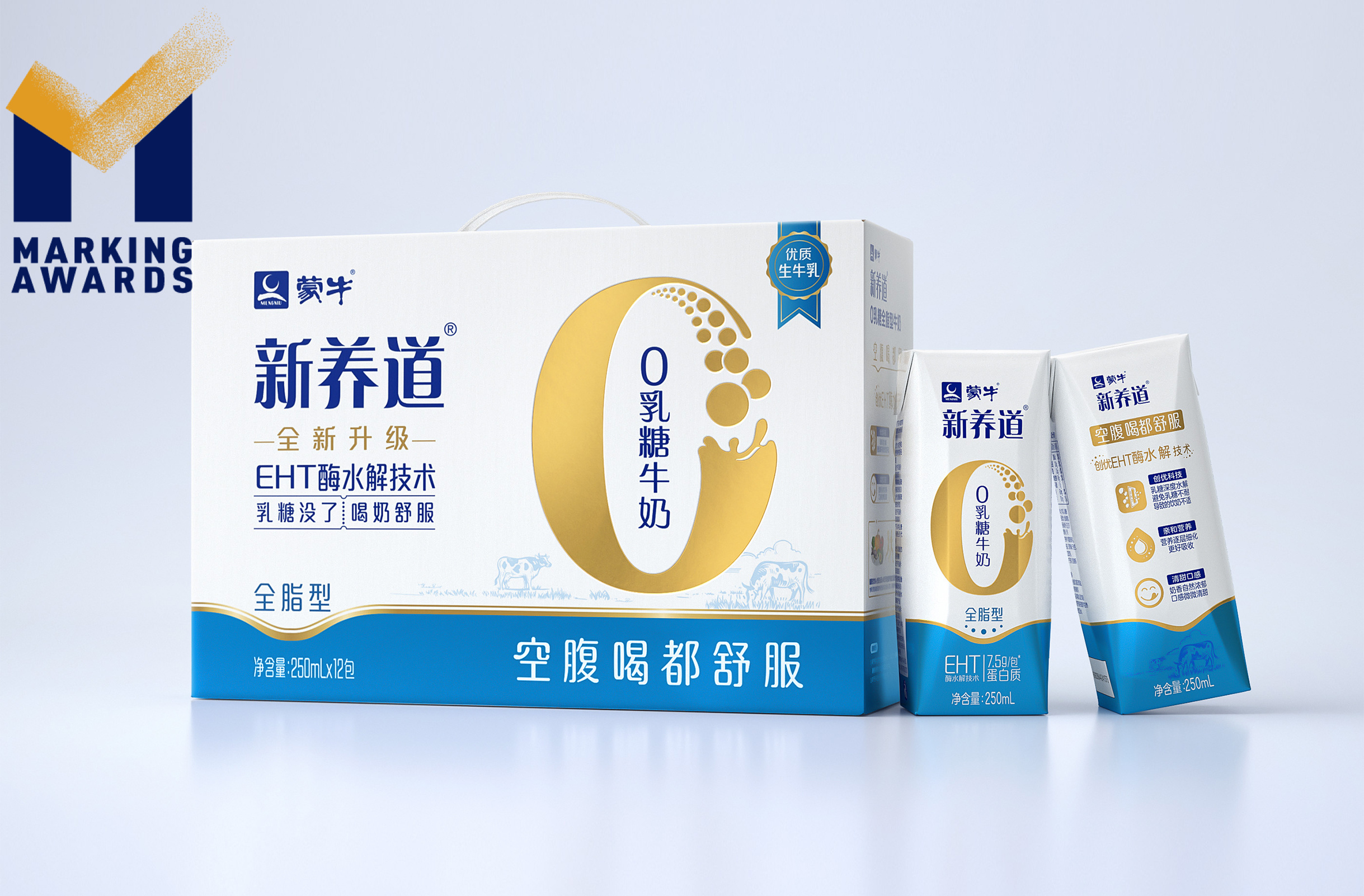
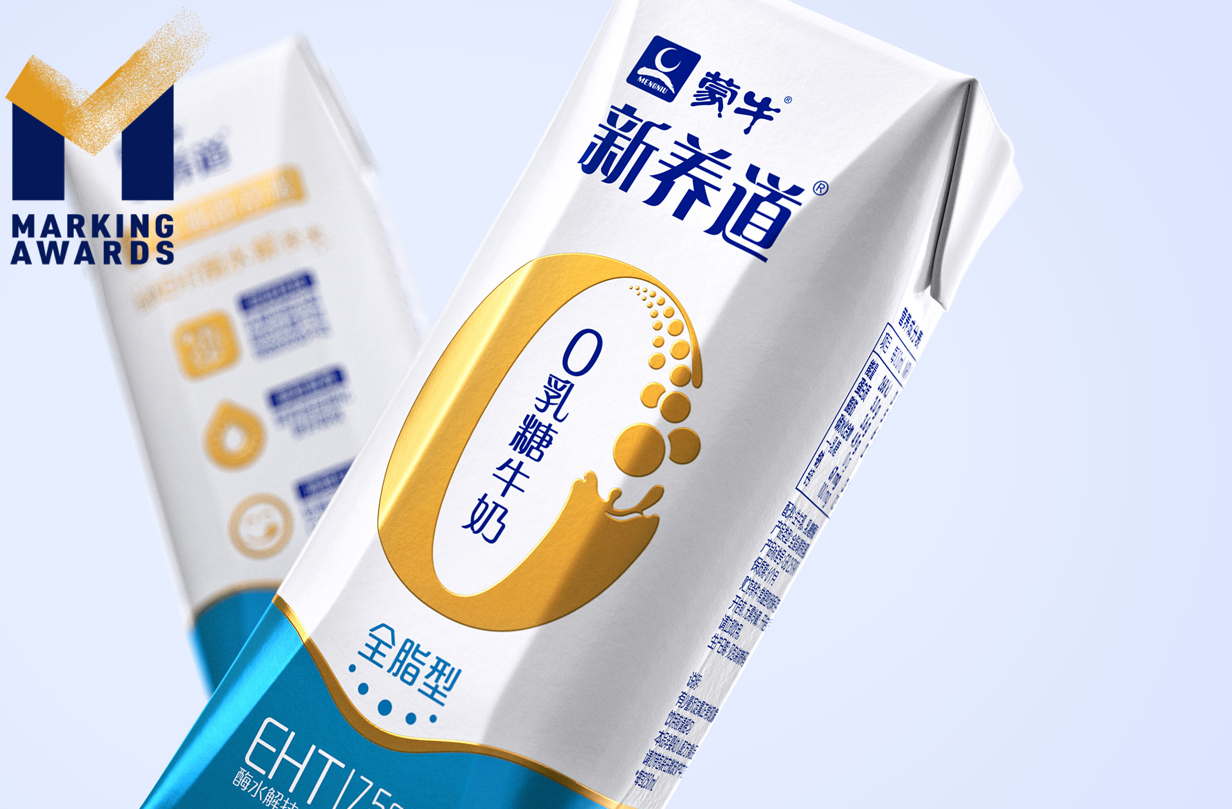
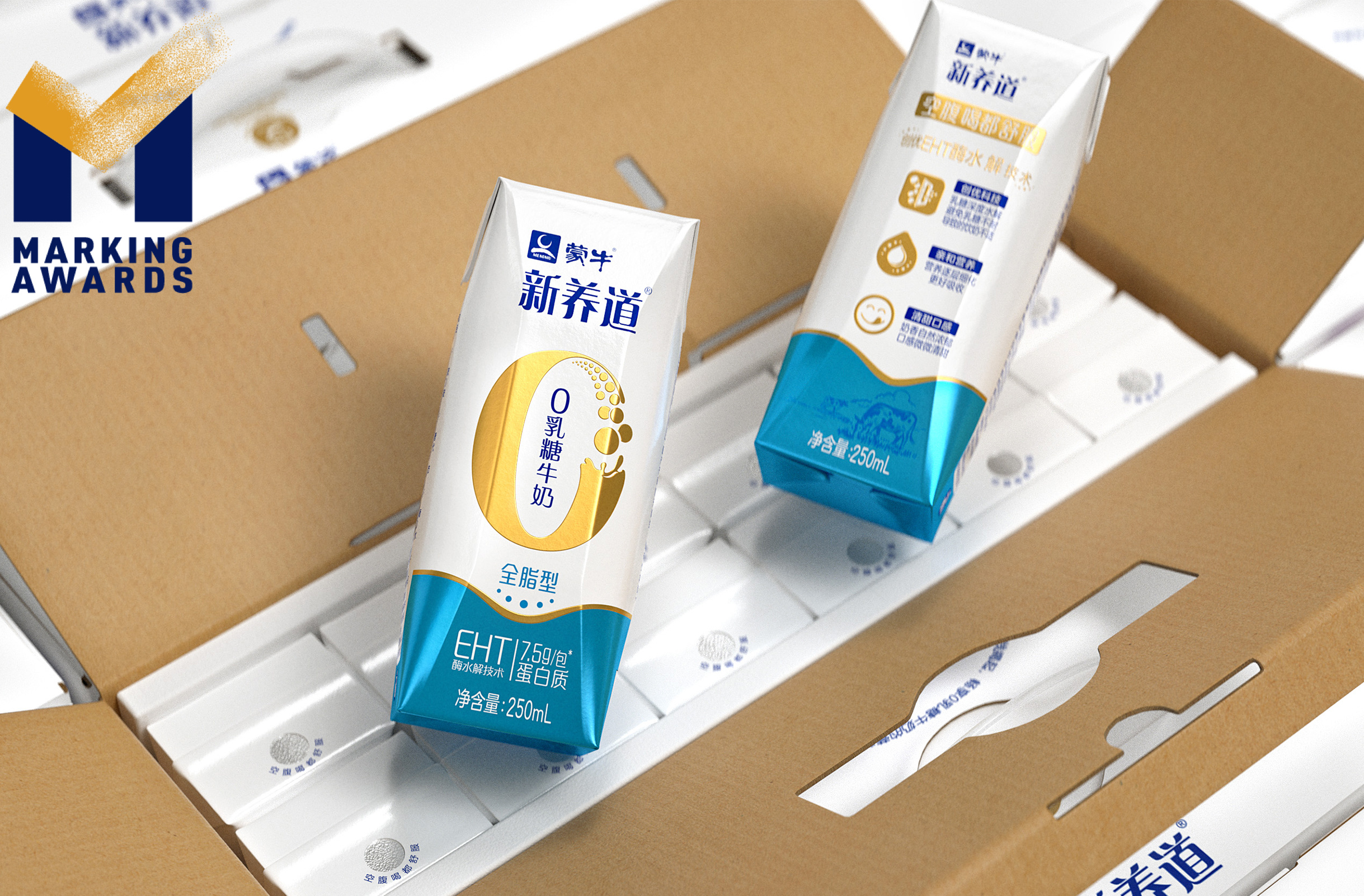
Mengniu Dairy Xin Yang Dao zero lactose milk is targeted at the vast group of lactose-intolerant people in Asia. The main selling point is its unique EHT (Enzymatic Hydrolysis Technology), which can decompose lactose into galactose and glucose, achieving zero lactose and promote absorption. Highlighting the core selling point is the focus of the packaging design. The white background color conveys the product’s category attributes and the scene of milk drops dripping into the milk reflects a sense of dynamism. Presented as large Roman numeral “0”, the milk drops portray a bold and direct graphic language. The dotted gradient symbolizes the product’s EHT and is closely linked to the core selling point of “0” lactose, establishing a recognizable visual symbol and enhancing visual brand identity.
Highlights
Its unique zero lactose technology highlights the core selling point. The middle “0” gradually turning into dots at the turning part reflects the process of lactose decomposition of milk through EHT.
Market Performance
Not
Material
纸质 Paper
Craft
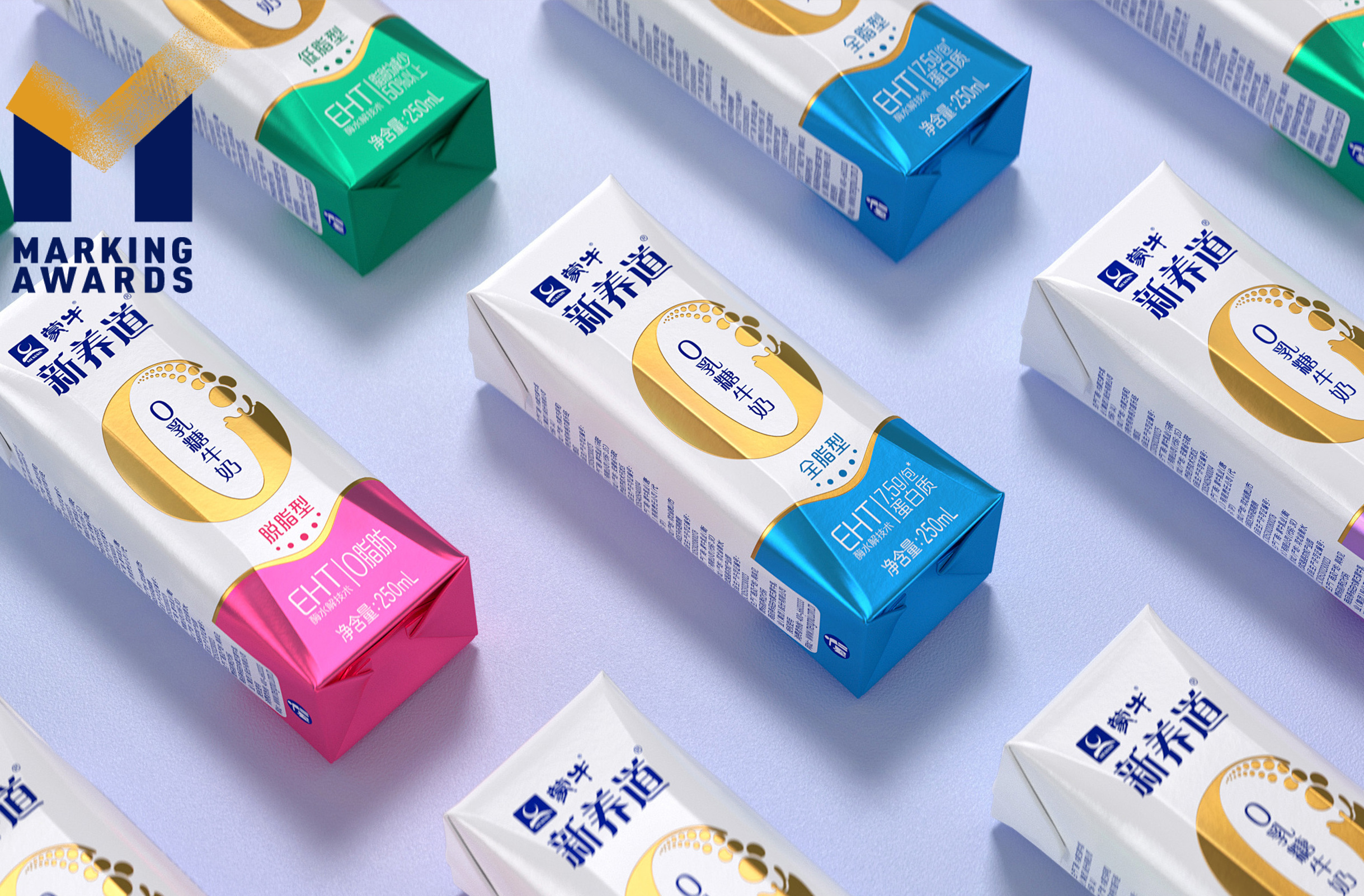
The diamond-shaped packaging reflects a sense of metal texture, through the contrast of the white padding colors and raw ones, making it appear more high-end and of excellent quality.
Does the design solve the problems that are common across the product category?
Its unique zero lactose technology highlights the core selling point. The middle “0” gradually turning into dots at the turning part reflects the process of lactose decomposition of milk through EHT.
What functional designs of the work have enhanced the user experience?
Intuitive visual indication that can quickly appeal to the lactose intolerant group.
Did the design help increase the sales performance of the product?
Not
Does the work consider sustainability (environmentally or commercially, or both)?
Not