
Country
U.K.(英国)
Official website
www.pearlfisher.com
Company Introduction
Pearlfisher is a strategic creative and brand design agency. We build the world's most desirable brands.
Images
Brand Name
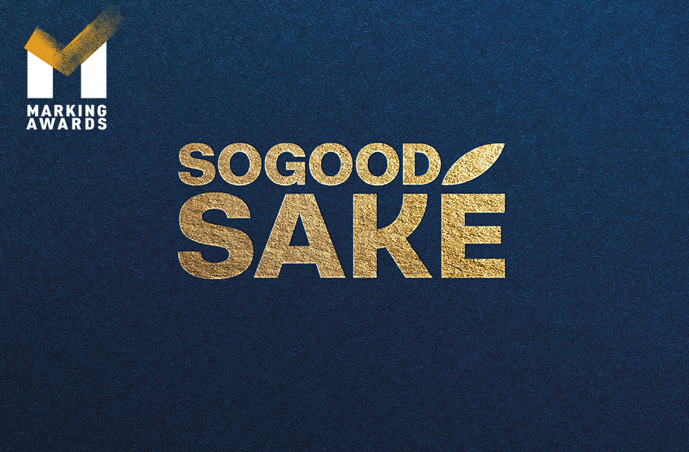
SoGood Saké
Designer Name
Pearlfisher
Position of Designer
Pearlfisher
Client
SoGood Saké
Target Group
Adults
Major sales
E-commerce
Positioning
Mass Production
Design Story
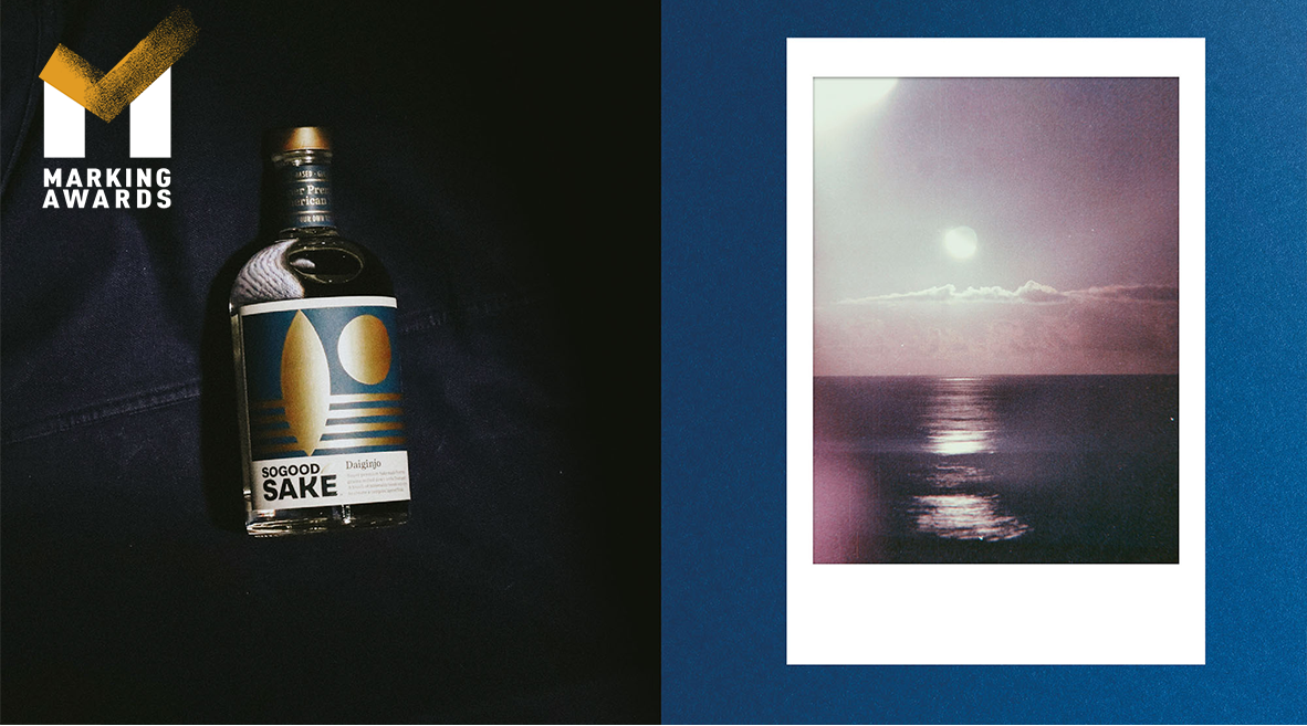
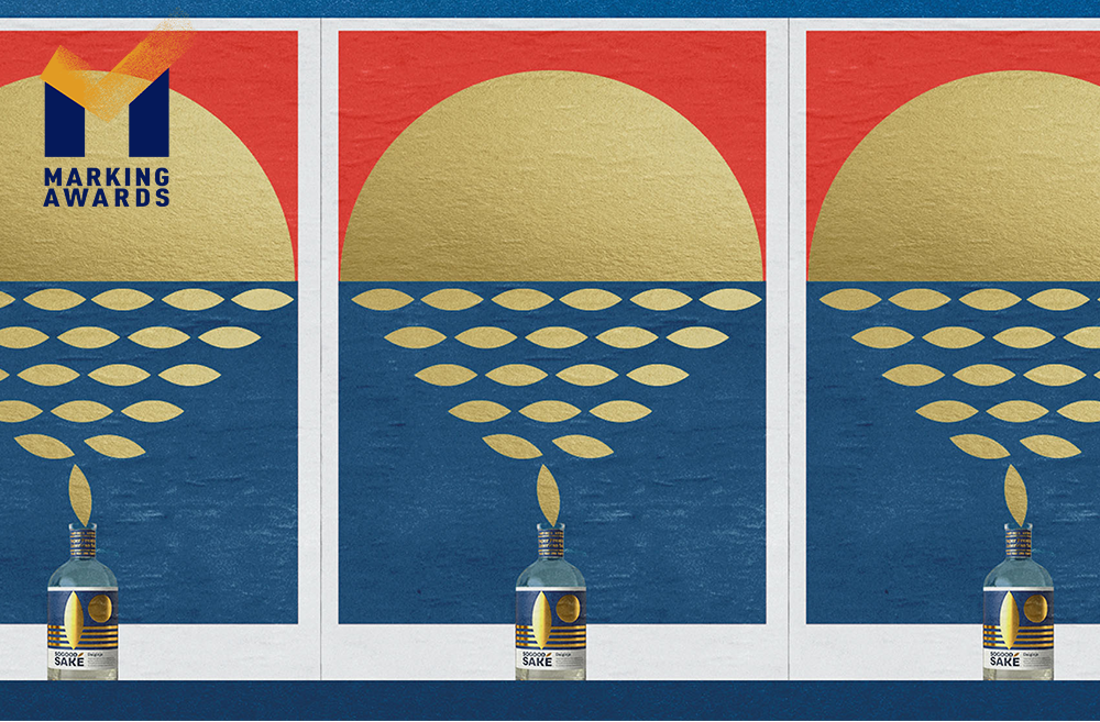
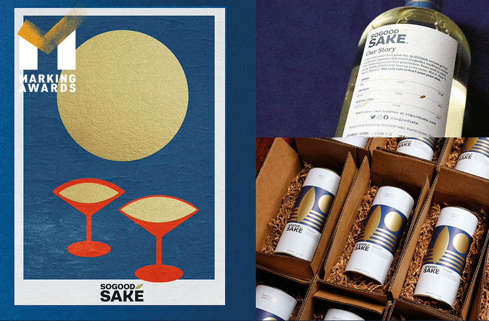
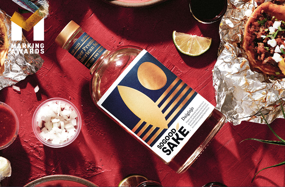
SoGood Saké is a super-premium saké with the mission to promote new occasions and food-pairing experiences. Made with rice that is grown, milled and perfected in California by the farmers who founded it, the SoGood brand controls production end-to-end. Implicit in the design are symbols that tell the story of the SoGood Saké brand and lifestyle. We began with the rice grain as the inspiration – by celebrating it and activating it as the accent over the ‘e’ as well as a golden asset that shines throughout the label. Product attributes are featured on the neck of the bottle, providing consumers with added information specific to saké and to SoGood at the point-of-sale.
Highlights
The label is one example of the use of bold, geometric shapes that at first appear to be abstract, but upon closer inspection are parts of a larger scene. On the Ginjo and Daiginjo labels, golden fields of rice are depicted as waves running perpendicular to a rice grain that stands upright like the silhouette of a surfboard. The setting sun on the label symbolizes the milled grain of rice that remains after milling the rice into a fine pearl. The bottle’s gold cap unites the structure with the gold foil printed on each label. Combined, the refined design and spirit tell the story of SoGood Saké – a brand that’s ready to re-write the rules.
Market Performance
N/A
Material
Other
Craft
The bottle’s gold cap unites the structure with the gold foil printed on each label. Combined, the refined design and spirit tell the story of SoGood Saké – a brand that’s ready to re-write the rules.