
Country
Armenia(亚美尼亚)
Official website
https://backbonebranding.com/
Company Introduction
Backbone Branding was founded in 2009 in Yerevan, Armenia. Ever since, the agency has become one of the leading names in the branding and packaging design field, having earned more than 70 awards from international competitions (Pentawards, A’design Awards, Makring Awards, World Brand Design Society, etc.) as well as projects implemented all over the world. Our works published on numerous magazines, books and design platforms worldwide such as getting the cover of the 5th edition of the Pentawards book. Backbone Branding has received the Pentwards title of Agency of the Year 2019 and 2020, making it the first agency in the region to receive this distinction as well as the first ever in the history of this competition to get the title two years in a row. Given that design is a universal language, the team has various international projects world wide. The founder and creative director of the agency, Stepan Azaryan is a jury member of professional design competitions including the Pentawards, D&AD, the Marking Awards, C-IDEA Awards, ADC awards, etc.) He has been solicited abroad to give speeches and talk about design philosophy and approaches. In 2019, in Shenzhen, China, he was invited to speak in front of thousands and 4.2 million live streaming audiences at the 20th anniversary of Baixinglong Creative Packaging (BXL)
Images
Brand Name
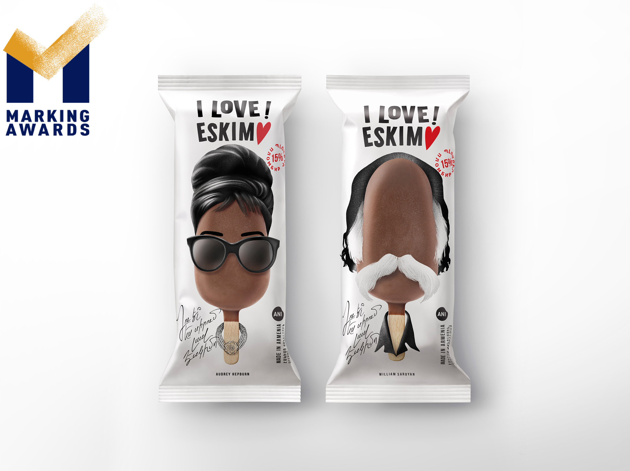
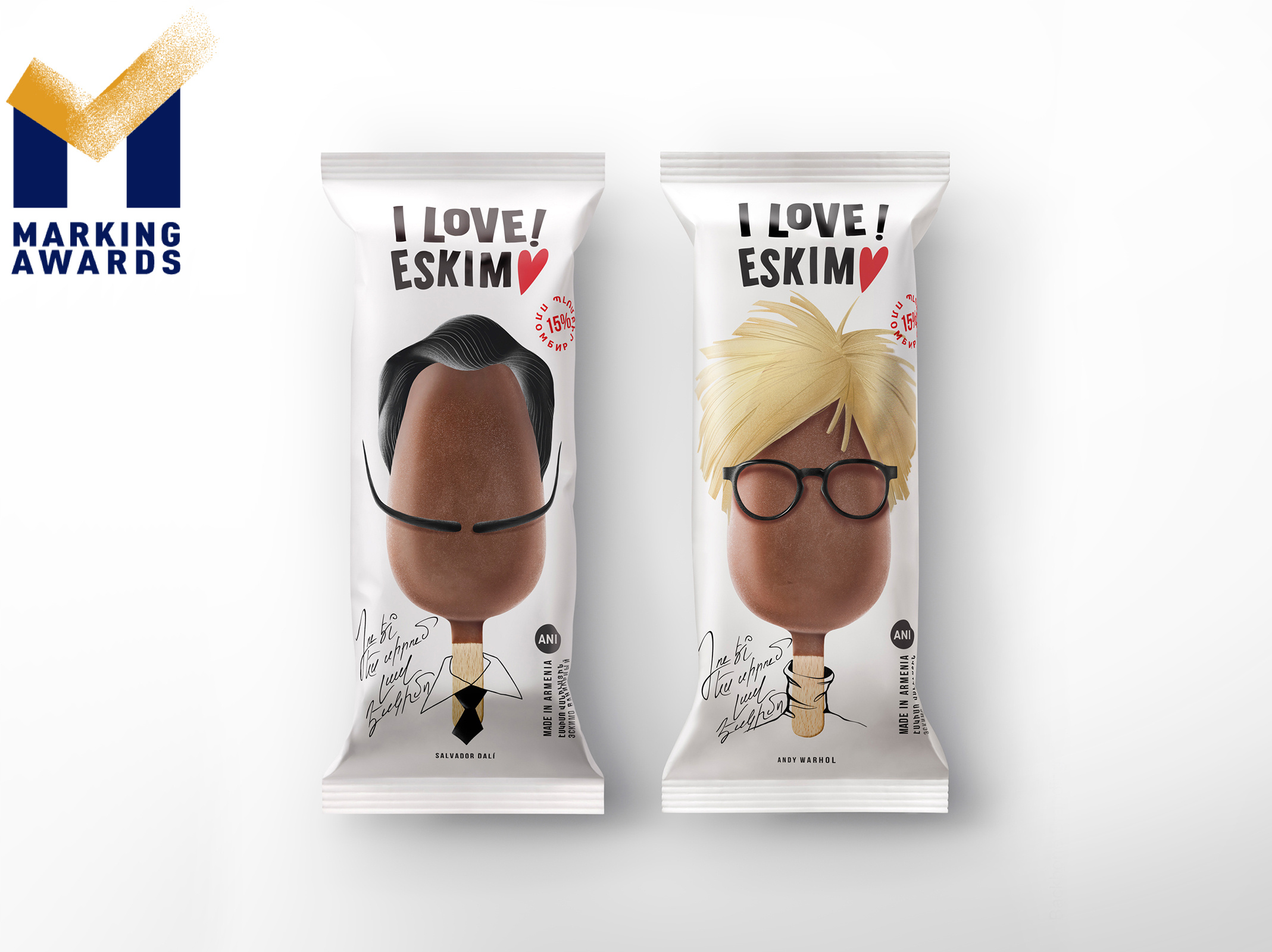
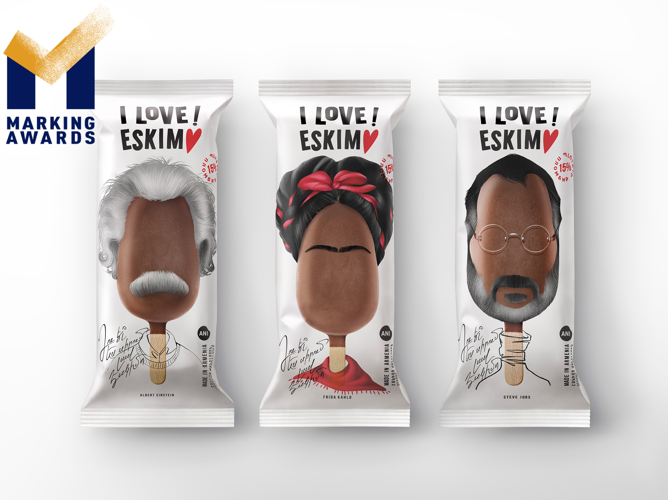
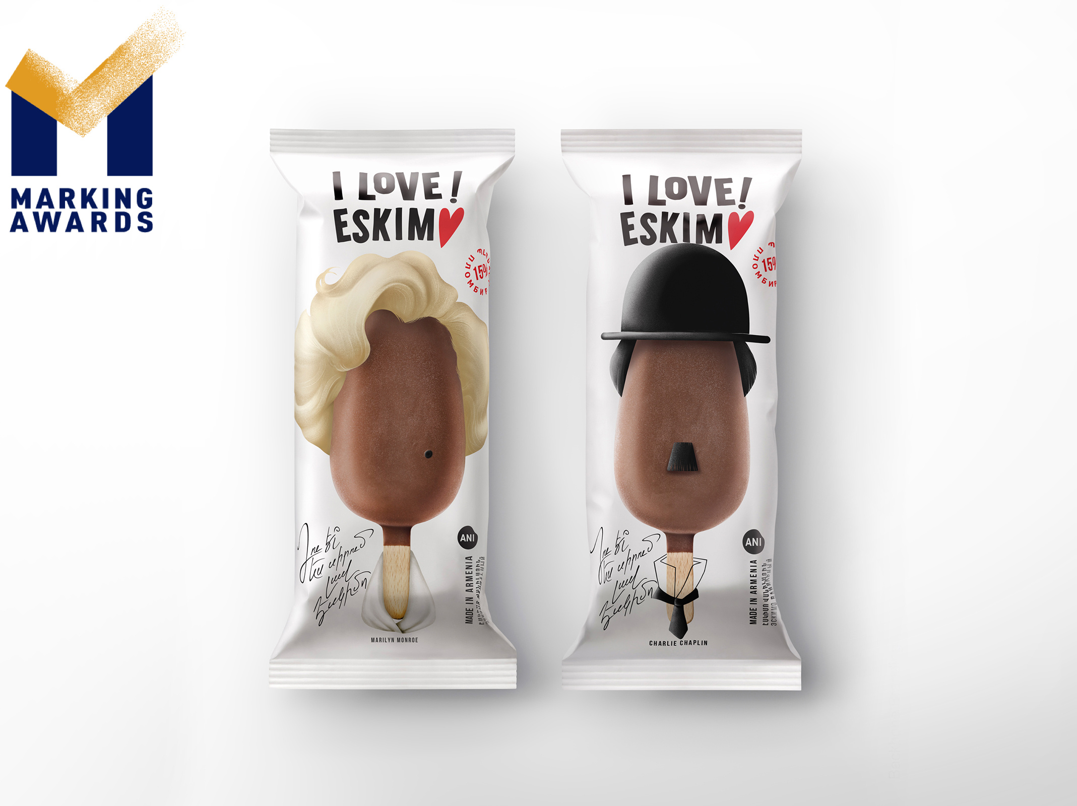
I LOVE ESKIM♥
Designer Name
Lusie Grigoryan , Stepan Azaryan, Elina Barseghyan, Ashot Hayrapetyan
Position of Designer
Brand Strategist։ Lusie Grigoryan Creative Director: Stepan Azaryan Illustrator & Designer: Elina Barseghyan Graphic Designer: Ashot Hayrapetyan
Client
Ani Product
Target Group
All ice cream lovers, regardless of gender, age and social status.
Major sales
Supermarket & CVS
Positioning
Mass Production
Design Story
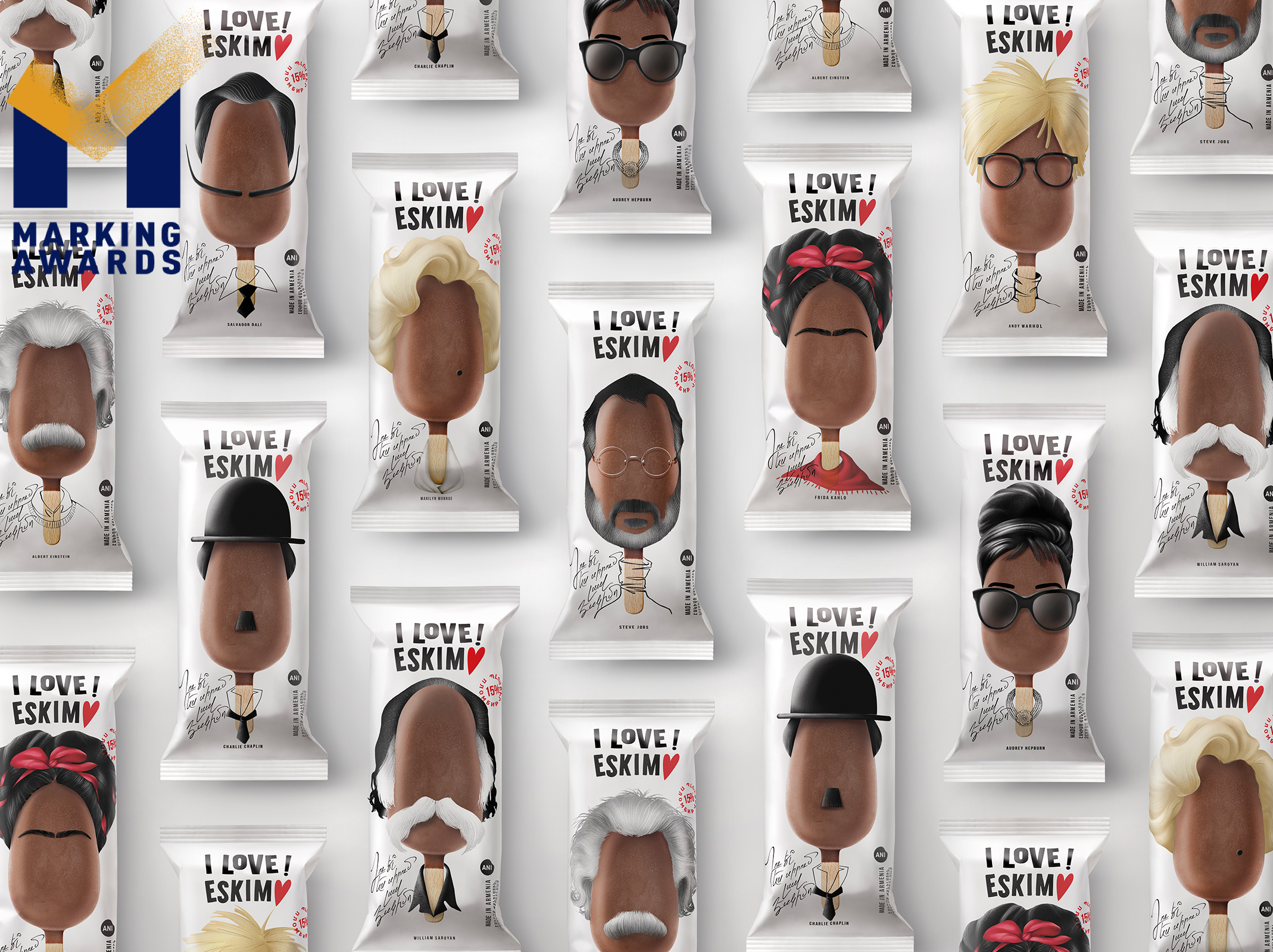
A dairy producer challenged us to create a unique packaging for their new ice-cream line and we chose an educational approach to educate wide ranges of society, especially young ice-cream lovers about the historical individuals who brought significant changes to the history․ We illustrated ice-creams with 9 remarkable characters, such as Einstein, Dali, Chaplin, etc., and allowing to enjoy each time differently with a new figure. Avoiding making characters too realistic, we illustrated their imitative images without face lineaments, instead using hair, glasses, mustache, and accessories to create resemblance and pass the emotions they convey. Nonetheless, we mentioned their names so that anyone can identify and study them. The front of the packaging is a signature resembling handwritten text, which illustrates a celebrity communicating with the customer in the local language: “You love a good Eskim♥ too, right?” The logo and text are black to be clearly visible on the white matte background, which communicates freshness and palatability. Eventually, we created a design that would educate and inform the young generation about these heroes' invaluable input, along with enjoying their sweet ice cream. Although the product is one, it allows us to enjoy it differently, with the accompaniment of a new hero each time.
Highlights
A dairy producer challenged us to create a unique packaging for their new ice-cream line and we chose an educational approach to educate wide ranges of society, especially young ice-cream lovers about the historical individuals who brought significant changes to the history․ We illustrated ice-creams with 9 remarkable characters, such as Einstein, Dali, Chaplin, etc., and allowing to enjoy each time differently with a new figure. Avoiding making characters too realistic, we illustrated their imitative images without face lineaments, instead using hair, glasses, mustache, and accessories to create resemblance and pass the emotions they convey. Nonetheless, we mentioned their names so that anyone can identify and study them. The front of the packaging is a signature resembling handwritten text, which illustrates a celebrity communicating with the customer in the local language: “You love a good Eskim♥ too, right?” The logo and text are black to be clearly visible on the white matte background, which communicates freshness and palatability. Eventually, we created a design that would educate and inform the young generation about these heroes' invaluable input, along with enjoying their sweet ice cream. Although the product is one, it allows us to enjoy it differently, with the accompaniment of a new hero each time.
Market Performance
When the brand entered the market in 2021, it immediately took a leading position in the ice cream market and also increased the company's internal ice cream production.
Material
PET material
Craft
We created an outstanding and unique design that at the same time fit in the master brand’s identity
Does the design solve the problems that are common across the product category?
none
What functional designs of the work have enhanced the user experience?
none
Did the design help increase the sales performance of the product?
none
Does the work consider sustainability (environmentally or commercially, or both)?
none